Friday, 27 December 2013

Calidar Hex Map Stretch Goal Reached

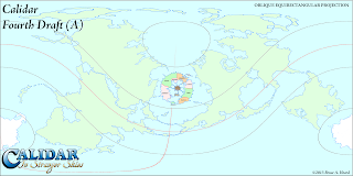
A preview of some of Calidar's hex art.
All rights reserved.
Thanks to our wonderful backers, who have just surpassed the 200 mark, Calidar's Kickstarter just reached its second stretch goal: an extra poster map featuring a hex map of Meryath!

This is major news for me, of course, because it means that for the first time, one of my hex maps will be printed up as a poster map.  I've been making these maps for years, so it's hard to express how excited I am about this.

It also means that I need to step up the pace, and get the designs for not one but two poster maps done.  Exciting times indeed.

Work has already begun on creating new hex art exclusive to Calidar.  You can see a preview of some of the hexes in the image at the top of this post.

Wednesday, 18 December 2013

A Study in Scale: Meryath

My article on scale was perhaps lacking in clear examples, so I have prepared some more images to show visually what I described in that article.

To recap, I have been developing the +World of Calidar on three different scales:

• World Map, 2 km/pixel
• Continental, 0.5 km/pixel
• Local, 0.125 km/pixel

The step down between each scale is a quadrupling of the previous one.  So a single 100 x 100 pixel area of the world map would become a 400 x 400 pixel continental map, or a 1,600 x 1,600 pixel local map.  It's important to understand that these scales all show the same area.

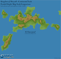
Kingdom of Meryath, Calidar, Eroded Height Map Scale Comparison, Albers Equal Area, Stereographic Projections
Kingdom of Meryath Scale Comparison
Here's what this looks like for Meryath.  Note that the full resolution local map is far too big to display at full size here, so I have scaled all the maps down to fit.  They are still in scale with each other, regardless of what size they are viewed at.

The point to take away from this is perhaps rather obvious, but its implications are not.  Clearly, higher resolutions show more detail.  Moreover, erosion produces more realistic results at higher resolutions/larger scales.  What's perhaps not so clear, but crucially important for cartography, is that the smaller scales are not meant to show things in great detail.

What this means is that even though the local scale map is much more detailed, it doesn't mean that it's better than the other maps.  Although it could be used to make the other two maps more detailed, you have to ask yourself if that's necessary – or even desirable.  Will it actually show more detail when reduced down so drastically?  There's a real possibility that it will in fact do the opposite, obscuring the important details with a mess of barely visible tiny details.

This is the crux, which I forgot to state clearly in my article on scale: world maps need only show world level detail.  Continental maps need only show continental detail.  Local maps are where you can go all-out on fine detail, but even then, if you feel like you're crowding things in, perhaps it's time to move down to another, larger scale still.

Finally, here are the three images in the scale comparison all scaled to the same size.  The local map has been shrunk down to less than a quarter its full size; the continental map is just a little smaller than full size; and the world map has been almost quadrupled from its native (rather tiny) size.  Bearing in mind the purpose of each scale, it's interesting to compare the difference in detail shown on each map.

Kingdom of Meryath, Calidar, Eroded Height Map Local Scale, Albers Equal Area Projection Kingdom of Meryath, Calidar, Eroded Height Map Continental Scale, Stereographic Projection Kingdom of Meryath, Calidar, Eroded Height Map World Map Scale, Stereographic Projection
Local Scale Continental Scale World Map Scale

World-building: Scale

Thorf's World-building Techniques: The Making of the World of Calidar
This is the second article in a series.
Click here for the series index.
For any kind of graphic, the size of your image or art board in pixels is an important consideration.  If you are ever going to print your image, you must also consider DPI (dots per inch).  If you are working with raster images, a good general rule is that reducing the size of your image is not a problem, but enlarging it is almost never a good option.  The reason for this is that it's easy to maintain sharpness when reducing, but enlarging invariably makes raster images look grainy and pixelated.

This rule applies to maps as well as other kinds of images.  Try to think of how you want to use your image, and choose your image size accordingly.  If you want to print it out, think about what size it will be printed at.  Print resolution standard is usually around 300 DPI.  If it's to be a wall poster, you'll likely need a rather large image.  If it's only going to be a small inset on a page, you can make it much smaller.

If, like me, you want to make an image that could cover all of these possibilities, the simple answer is to start big.  How big depends on the biggest usage you can imagine, plus one other factor: how big can your computer handle?

Before we delve into the topic of scale as it relates to digital maps, there's one more thing to consider: it may be tempting to try to work with a single, massive world map which can be zoomed in and cropped to provide continental maps.  I can't recommend this approach, firstly because it will cause you problems thinking about what size to make labels, and indeed what levels of labels to include.  Bear in mind that a world map is a world map, and unless it's designed to be printed out as a poster, it needn't display low level detail.  To put it another way, if you have to zoom in to see something clearly, it probably belongs on a continental or local map.

The second reason is that choice of map projections is severely limited for the world map, since by its very nature it shows the whole world at once.  Better to make separate, more detailed continental/regional maps, with increased levels of detail, as well as more appropriate map projections.

Now let's start talking numbers.

Scale
It seems to me that the most practical way to measure scale in digital raster maps is in kilometres per pixel, which I notate as km/pixel, or kmpp.  Raster images are made up of pixels as their smallest units, and most users are used to dealing with pixel sizes to at least some degree.

For an earth-like world, we have a great example of this in NASA's Blue Marble: Next Generation.  This wonderful (and beautiful) resource provides composited satellite imagery of the earth in Equirectangular Projection at three scales: 5,400 x 2,700, 21,600 x 10,800, and 86,400 x 43,200.  The last resolution is the full resolution, and NASA writes: "Blue Marble: Next Generation offers a years worth of monthly composites at a spatial resolution of 500 meters [per pixel]."

Let's think about those numbers.  Remember that Equirectangular maps are accurate at the equator, with increased east-west distortions as you move north or south.  This means that east-west measurements should be made at the equator.  500m per pixel means 0.5 km/pixel.  Multiply by 86,400 and we see that this model has the earth's circumference as 43,200 km.  Actual earth equatorial circumference is 40,075.017 km (according to Wikipedia), so the true resolution is likely around 0.46 km/pixel.

You can make the same calculations using north-south distances, because Equirectangular maps do not distort north-south distances.  The result is the same.

Calidar's circumference is in fact precisely 43,200 km, meaning that an 86,400 x 43,200 map is precisely 0.5 km/pixel for Calidar.  But this size is far too unwieldy for today's computers to work with, so I chose to go with a 21,600 x 10,800 base world map.  Do the maths and you'll see that this is equivalent to 2 km/pixel.  I will likely downscale this to 5,400 x 2,700, or 8 km/pixel, for printing at smaller sizes.

For my purposes, 21,600 x 10,800 seems like a good size of world map to be working with.  It's not insanely huge in terms of working in Photoshop and other programs using my current computers, and it provides a level of detail that can be printed extremely large (72" x 36" at 300 DPI), or reduced to be printed smaller.

World of Calidar Eroded Height Map Draft, Climate Shading Test, Equirectangular Projection
My first attempt at a height map for the +World of Calidar.  Note how
the mountains are huge – they dominate the continents as if they were
mere islands.  The colouring is climate-based shading done in Fractal
Terrains.  While this was the very first full world height map, this test
remains the only full climate shaded version of the world map to date.
As such, it was used to create the 3D render of Calidar seen in the logo
for this series and throughout Calidar's online presence.  It will
eventually be replaced with the finished map, once all of the continents
have been eroded. This was a very small test, at 3,000 x 1,500 pixels.
Height Maps and Scale
There is another reason for my choice of such a big image size, which is that the relative scale of terrain when you build a height map depends on image resolution.  More specifically, if you work with erosion, the results of the erosion filters approximate a certain real world scale.  This is why I have chosen to develop Calidar at such high resolution.

To recount my thought process here, I first created a height map of Calidar at 3,000 x 1,500 as a trial, but it quickly became obvious that the terrain was off-scale – individual mountains were hundreds of miles across.  In an attempt to solve this problem, I moved up to 21,600 x 10,800, but the results still did not satisfy me.

My solution has been to work in three separate scales: 2 km/pixel for the world map, 0.5 km/pixel for continental maps, and 0.125 km/pixel for local maps.  The size of the world at these scales is 21,600 x 10,800, 86,400 x 43,200, and 345,600 x 172,800 respectively – but note that the last of these will likely never be fully developed, nor is there any need to do so.

World of Calidar Eroded Height Map Draft, Altitude Shading, Equirectangular Projection
The first full 21,600 x 10,800 height map of Calidar.  In my notation, D
refers to the world map version: this is the fourth version of the fourth
(and final) draft of the continental outlines.  I advance the letter whenever
significant tweaks are made to the outlines, or when I start a new draft of
the height map.  This map was changed to version E partway through.
Note how the mountains are much finer than on the D test version, and
yet still far too big for the mountains of an approximately earth-sized
world.  This is the last time I played with coastal shelves and the sea
floor – after this map, I decided to leave them until after the land is all
finalised.
What this three stage system does is provide a nice level of terrain detail without going overboard with realism.

Wilbur's Erosion and Scale
My primary tool of choice for erosion is Joe Slayton's Wilbur, the sister program of Fractal Terrains.  Joe Slayton is a regular member of the Cartographer's Guild, and he is very gracious about answering questions and giving information about his software.  He has stated that Wilbur's erosion model approximates realism at a resolution of between 1 and 50 m/pixel, or 0.001 and 0.05 km/pixel.

World of Calidar Eroded Height Map Draft, Altitude Shading, Equirectangular Projection
I wasn't happy with the DE height map, so I started again with another
pass at the height map in Photoshop.  This is the eroded result.  You can
see the current design beginning to take shape, but the scale is still off.
A world built at 0.05 km/pixel would measure a whopping 1,080,000 x 540,000 pixels.  Clearly it is beyond the realms of possibility to develop the whole world at that level.  However, small local areas could certainly be done at this resolution.

For Calidar, this would mean one last quadrupling of the scale, from my "local" 0.125 km/pixel to a super-local 0.03125 km/pixel, or 31.25 m/pixel.  It's not beyond the realms of possibility that the need for such a map may arise in the future – for example, a detailed map of the area around a settlement.

Town maps may go further than this, of course, but by that point, terrain is hardly an issue, so it's really a moot point as far as height maps go.

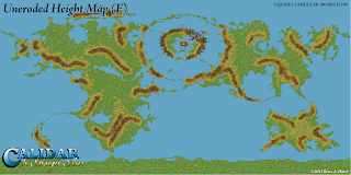
World of Calidar Uneroded Height Map Draft, Altitude Shading, Equirectangular Projection
Map F marked the final design for the world map's height map, and I
never ran it through the erosion process – instead I split the world up
into continents at quadruple the resolution, with each continent
reprojected to a more suitable projection.  From there, each continent
has undergone its own development and refinement, and only when
they are all finished will the world map be reassembled again.
At that point the world map will be 86,400 x 43,200, but I will
likely shrink it back down to 21,600 x 10,800 to make it more
 manageable, leaving the fine detail for continental and local maps.
To sum up: the ideal resolution for Wilbur erosion is 0.05 km/pixel, but such realism is probably only necessary for local maps of small areas.  In terms of developing the world as a whole, much lower resolutions should give acceptable results, although the lower you go, the more blocky and oversized your terrain will begin to feel.

Traditional Scale
Those of you who are familiar with real world paper maps may have seen scales quoted as ratios: 1:500,000 scale, or 1:10,000 scale, and so on.  Depending on your background, you may or may not be familiar with what these numbers mean.

I find it useful for the sake of comparison to know what the equivalent scale in km/pixel is for each of these scales, so I researched the issue and came up with the following table.

Hex Scaleskm/pixelScale 1:?km width/1000 pixelsScaleWilbur
100200,000,000100,000Small Scale
50100,000,00050,000
2550,000,00025,000
1020,000,00010,000
7.214,400,0007,200
510,000,0005,000
24,000,0002,000
30 miles per hex1.53,000,0001,500
12,000,0001,000
10 miles per hex0.51,000,000500
0.33660,000330
0.25500,000250
5 miles per hex0.2400,000200
0.15300,000150
0.125250,000125
2.5 miles per hex0.1200,000100Medium Scale
0.05100,00050Ideal scale for Wilbur erosion
1 mile per hex0.0480,00040
0.02550,00025Large Scale
0.00510,0005
0.00255,0003
0.0012,0001
0.00051,0000.5

Note that the meanings of the phrases "small scale" and "large scale" are routinely mixed up in vernacular usage.  It's a natural mistake, because s
mall scale refers to progressively larger areas, while large scale refers to smaller areas.

A trick for remembering the correct meanings is that small scale refers to a view of everything from very high above, or very far away, making everything appear small.  Large scale conversely means looking at things from much closer, so that everything appears large.  Small scale will have generalised features, while large scale can include very precise detail.

Note also that the ranges for small, medium, and large scale presented here are not universal.  There is apparently no standard.  Wikipedia's article on map scale provides a different set of ranges, for example.

In terms of fantasy maps, the split could be considered as follows:

• Small scale: world maps, continental maps, many local maps
• Medium scale: some local maps, some city maps
• Large scale: some city maps, town & village maps, adventure location maps, floor plans

Hex Maps and Scale
Kingdom of Meryath, Great Caldera, Calidar, Eroded Height Map Hex Guide, Albers Equal Area Projection
This is the local scale version of Meryath, 0.125 km/pixel at full
scale, or sixteen times the resolution of the world map.  The hexes
here are 10 miles per hex (16 km per hex).  The precise
measurements mean that no scaling is necessary to use this as a
guide in Hexographer or Adobe Illustrator.
You may have noticed that I included hex scales in the table above.  We can calculate the km/pixel scale for a hex map quite easily, simply by dividing the height of a hex in pixels by its scale in miles or km.  How meaningful this may be is another matter, but it can be useful to know for the sake of comparison, and especially if you are working from a guide to create a hex map.

Calidar's hexes are 39 pixels tall, with the standard hex size being 10 miles per hex.  We may also be making 30 mile per hex regional maps, but not any smaller scales.  Larger scale 5 or 2.5 mile per hex local maps are also a distinct possibility.


I have done all the measurements in this article so far in km, so here are the scales in km/pixel for each scale of hex:

30 miles per hex – 1.23 km/pixel
10 miles per hex – 0.41 km/pixel
5 miles per hex – 0.21 km/pixel
2.5 miles per hex – 0.10 km/pixel

The nature of hex art of course means that in real terms hex maps don't include anything like this level of detail, but it's interesting to have the numbers for the sake of comparison nonetheless.

Conclusion
This has been a rather technical and probably boring article for many people.  Thank you if you read this far!  I hope it will prove useful for cartographers, at least.

Next in the pipeline is an article on creating base height maps in Photoshop.

Thursday, 12 December 2013

Calidar Kickstarter Has Begun!

+Bruce Heard just hit the big green button, signalling the start of the Kickstarter.


This is it, folks.  This is what we've been working so hard over the past six or seven months to bring to you.  You can make it possible.

But let's not stop there: let's make it a massive success!  I want to still be reading new Calidar stories from Bruce ten years from now.

Vote with your feet, and opt in to the World of Calidar now.  We're counting on you.

Here's a freebie for you to enjoy - my latest test map of the Great Caldera.  You can see it on the Kickstarter page, too.  The final format has yet to be decided, but these one of the possibilities for the Great Caldera poster map.

The Great Caldera, Calidar, Topographic Map, Stereographic Projection
The Great Caldera Topographic Map, Stereographic Projection
And here's a crop at 2/3 resolution...

Close-up of Araldûr from The Great Caldera, Calidar, Topographic Map, Stereographic Projection
Close-up of Araldûr from the map above
 The full size file has so much detail.  It's going to be a gorgeous poster map.

Close-up of Meryath from the map above
Thanks for supporting Calidar!

Wednesday, 11 December 2013

World-building: Continental Outlines and Map Projections

Thorf's World-building Techniques: The Making of the World of Calidar
This is the second article in a series.
Click here for the series index.
The first step in creating a whole world is to create a set of continental outlines.  There is good reason to make this the first step: at this point, it's a simple matter to make tweaks and adjustments until you have things looking just the way you want.  The further you progress through your world-building project, the more troublesome this will become, so that later on even a minor tweak may potentially require time-consuming revisions to be made throughout your work.

To sum up: now is the time to try things out, reject what you don't like, keep what you do, and most importantly keep tweaking until you get things just right.

Concepts
Before we get started, there are some things to bear in mind when creating our world map.  First and foremost, the world map is necessarily an extremely small scale map.  Consequently, it cannot show your world in very high detail; nor does it need to.  In many respects, world maps are vague and inaccurate.  They simply lack the kind of resolution needed to display high levels of detail.  In layman's terms, they are just too far zoomed out to see much more than general shapes.

What this means is that your world map is your base map, upon which all other maps are based, but regional and local maps do not have to reflect it 100%.  On the contrary, they should develop and expand upon the foundations contained in the world map, introducing new details too fine to show up on it, as well as revising and enhancing those details that did appear on the world map.
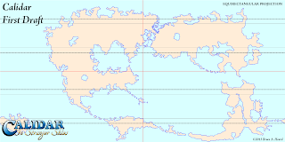
The World of Calidar, First Draft World Map, Equirectangular Projection
+Bruce Heard's very first design for Calidar's world map.  Note 
how the Great Caldera is already present, but joined up with the 
adjacent continents.  This map was drawn directly onto a 2:1 
Equirectangular Projection using Paint.NET.  The resolution 
was 6000 x 3000.
Generally, regional maps will be created by cropping your world map, then resampling to a higher resolution.  Local maps can then be done in the same way, based on regional maps.  With Calidar, I increase resolution by a factor of four for regional maps, then increase by a factor of four again for local maps.

If you deem it necessary, the world map can be rebuilt later to reflect the more detailed regional maps, but this should be considered strictly optional.  There is probably not a lot to be gained by doing so, as the lower resolution of the world map will obscure the added details anyway.  In general, world maps should remain reasonably simple and unburdened with tiny details, to fulfil their main purpose as overview maps.

Software
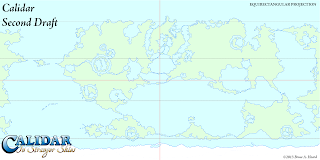
The World of Calidar, Second Draft World Map, Equirectangular Projection
Bruce's second draft incorporated impact craters throughout the
world, so that there were numerous areas like the Great Caldera.
It also split the Great Caldera from its neighbouring continents.
When it comes to drawing the actual outlines, pretty much any paint software will do - raster or vector.  Personally I like Adobe Illustrator's vectors for this stage, but Adobe Photoshop or an equivalent raster editor is just as effective.  You can go back and forth between raster and vector using auto-trace when necessary.

The reason for this is that at this stage, only the general shapes are important; small details on the coasts can be added later, so there's no need to worry about things looking too regular.
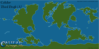
The World of Calidar, Third Draft World Map, Equirectangular Projection
I took a stab at the third draft, tracing Bruce's outlines to Illustrator
vectors.  I went back to the first draft and tried to split things up to
look more earth like.

It's worth noting here briefly the differences between raster and vector art.  Raster graphics, also known as bitmaps, are comprised of arrays of tiny dots known as pixels.  Most people are familiar with these images from photographs, paint programs, and indeed the Internet.  Common formats are PNG, JPG, and GIF.  Photoshop and most other paint programs mostly work with raster images.  Raster images can often be shrunk down without incurring great problems, but enlarging them causes them to become blocky and/or blurry, and is best avoided.  This means that you need to consider what resolution to work in from the start, because you won't be able to increase it later on.
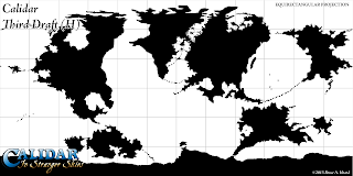
The World of Calidar, Third Draft World Map, Equirectangular Projection
My last attempt.  Note how we worked in a range of colour schemes;
at this stage in the design, working with whatever's easiest for you is fine.
Although these drafts were all ultimately rejected, you can see elements
of the final design slowly appearing.  At this stage, Bruce realised that the
design had wandered away from the central concept of the Great Caldera
being a safe haven, isolated from the Dread Lands around about, and we
went back to the drawing board.
Vector graphics, in contrast, are made up of mathematical descriptions of lines and points.  They don't use pixels at all, although they can be rasterised – i.e. changed into pixel arrays.  Because they are defined using lines and points, it's possible to resize them freely without losing sharpness.  Fonts are probably the most common vector graphics encountered in daily life.  Illustrator works primarily with vector graphics.  Vector formats include SVG, DXG, AI, and many others.

In Calidar’s case, Bruce worked with PNG raster images in Paint.NET.  I then auto-traced those images in Illustrator, turning them into vectors, before making adjustments and exporting to PNG to send back to Bruce.  I prefer vectors for coastlines, but lately I have been using high resolution raster PNG files more and more, because it's easier to roughen coastlines on a raster image.

Projections
Images in this section are courtesy of USGS.  Check their Map Projections Poster for a full description of all the concepts in this section.


Miller Cylindrical Projection
Miller Cylindrical
Planets are three dimensional objects: spheres, or more accurately ellipsoids.  Maps, on the other hand, are flat two dimensional representations.  When you make a two dimensional representation of a three dimensional planet, distortion of some kind is unavoidable.

Lambert Conformal Conic Projection
Lambert Conformal Conic
In order to create a flat map from an ellipsoid, a projection is needed.  There are various kinds of projection, depending on how coordinates on the ellipsoid are mapped to coordinates on the map.  The three basic types are cylindrical, conic, and azimuthal.  There are other types; for example, pseudocylindrical projections are commonly used for presenting world maps in modern atlases.

Stereographic Projection
Stereographic (Azimuthal)
It’s important to understand that no projection can accurately represent every property of an ellipsoid.  All projections introduce distortion of some kind.  In fact, each projection can generally only preserve one or two properties.  This is what guides the choice of projection for each map.

Properties that can be preserved include:

• Shape
• Area
• Distance
• Direction
• Bearing
• Scale

Of these, shape, area and distance are probably the most important, and projections that preserve them are the most well-known and widely used.

Projections preserving shape are known as Conformal Projections.  Examples include Mercator, Stereographic, and Lambert Conformal Conic.
Albers Equal Area Projection
Albers Equal Area

Those which preserve area are called Equal Area Projections.  Examples include Gall-Peters, Albers Equal Area, Lambert Azimuthal Equal Area, as well as Mollweide and Hammer.


Sinusoidal Projection
Sinusoidal
Equidistant is the name for distance-preserving projections.  Examples include Equirectangular, Azimuthal Equidistant, and Sinusoidal.


Robinson Projection
Robinson
A fourth kind of projection that sees a lot of use is the category of Compromise Projections.  These projections don’t preserve any property perfectly, instead aiming to strike a balance between distortions in multiple properties.  Examples include Robinson, Van der Grinten, Miller, Winkel Tripel, and Dymaxion.

Mercator Projection
Normal Aspect Mercator
Transverse Mercator Projection
Transverse Aspect Mercator
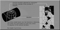
Finally, another important property of projections is their aspect.  There are three aspects: normal, transverse, and oblique.  Aspect refers to the orientation of the base plane of the projection to the ellipsoid.  Normal aspect means that it is aligned with the “normal” view of the planet.  In the case of a cylindrical projection, it’s easy to imagine the earth inside a vertical tube, with the tube touching the cylinder at the equator.  Transverse means that the cylinder is horizontal, touching a meridian instead of the equator.  Transverse projections are therefor at a 90Âş angle to normal projections.  Oblique means that it is angled somewhere between normal and transverse, which means that the cylinder doesn’t correspond to any parallel or meridian.
Oblique Mercator Projection
Oblique Aspect Mercator

Further reading on projections:
Map projections at Wikipedia
• Map Projections Poster at USGS
How to choose a projection at Hunter College (highly recommended!)
• G.Projector User's Guide: Projection List

Advantages of Projections
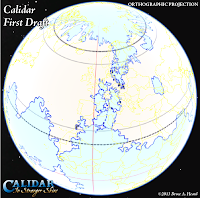
The World of Calidar, First Draft World Map, Google Earth Orthographic Projection
Bruce's original world map design as an
image overlay in Google Earth
If you don’t care about projections, you’re good to go - draw your world map in whatever shape you like, and stick with it.  Many fantasy cartographers do just this, and produce stunning works of art without ever worrying about what projection the map is in.  There’s nothing wrong with this approach – we are dealing with fantasy, after all.  All fantasy cartographers sacrifice some aspect or other in order to produce maps in a reasonably timely fashion, and I would hate to force my style on someone else just for the sake of “accuracy”.

With that said, there are quite a few advantages to using projections in your maps, should you wish to do so.  For example, you will be able to:

• Take advantage of reprojection techniques to design good-looking polar areas, avoiding distortion and spikiness.
• Produce multiple versions of your world map, choosing a projection to match the theme of each.
The World of Calidar, Icosahedral Net
Icosahedral net made in Fractal Terrains
using an Equirectangular height map
• Choose suitable projections to show each region of your world in its “true” shape.
• Take advantage of the properties of each projection in your maps.
• Place your map on a 3D model such as Google Earth.
• Create icosahedral maps or interrupted (segmented) projection maps to make paper globes.
• Make animated spinning planets using Photoshop’s 3D, or a 3D rendering program such as Bryce.
• Render impressive orbital views and space scenes.
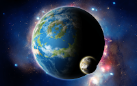
Render of the World of Calidar with one of its moons, Kragdûr
Orbital view rendered in Photoshop using
Equirectangular planet and moon maps
Some of these things are possible to do without using projections, but results will vary depending on the characteristics of your map.  And if you’re anything like me, the “inaccuracy” of such an approach will likely bother you, and take away from the final maps.

For Calidar, we decided from the very start to work with projections.  I had long wanted to do so with my work on Mystara, but was held back by the choices of Mystara’s original cartographers back in the 1980s.  This is not a criticism - on the contrary, I have the utmost respect for all of the cartographers who worked for TSR, and they have undoubtedly influenced me more than anyone else.  Of course, TSR's cartographers did not have access to the kinds of computers and software that we do today, so their job was that much harder.

Working with Projections
Before computers became so ubiquitous as they are today, cartographers were forced to make difficult calculations, or to use complex tables to convert maps from one projection to another.  These days, however, there is freeware software to do this for us.

The most useful I have found is NASA’s G.Projector.  There is also QGIS, but it’s much more complicated and harder to use.

If you want to take full advantage of projections, there are various commercial software options to choose from too.  I use Manifold, which is one of the more affordable programs.  I would love to be using Avenza Systems Inc.’s MAPublisher and Geographic Imager, which enable projection and other GIS functions directly within Illustrator and Photoshop respectively, but both are well out of my price range.

Whatever software you choose, you will need to learn how to load images into it, georeference them if necessary, change projections, and then export back to your usual image format.

Projections and the World Map
For various reasons, the best projection to work with for your world map is the Equirectangular Projection.  Also known as Geographic Projection, Plate CarrĂ©e, or Latitude/Longitude Projection, it is nothing more than a simple grid of latitude and longitude.  This inherent simplicity makes it a relatively easy projection to work with.  But it’s important to know its strengths and shortcomings.

Equirectangular Projection
+ Simple grid of latitude by longitude, giving a 2:1 ratio image.
+ The required projection for Google Earth image overlays and texturing 3D models.
+ Up is always north, left is always west, etc.
+ Low north-south distortion of shapes.
+ North-south distances are accurate throughout the map.
- High east-west distortion of shapes, progressively increasing as you move away from the equator.
- Poles are stretched across the entire length of the map, making the polar regions difficult to work with.
- East-west distances are accurate only along the equator, and difficult to measure accurately elsewhere.

The World of Calidar, First Draft North Pole, Google Earth Orthographic ProjectionThe World of Calidar, First Draft South Pole, Google Earth Orthographic Projection
Google Earth image overlays showing the original designs for Calidar's north and south poles.
The results were somewhat less than stellar.  Due to this distortion, we all but abandoned polar 
landmasses in the second draft.  It wasn't until the fourth draft that we tackled the problem, 
with the help of G.Projector and the Oblique Equirectangular Projection.

In terms of creating continental outlines, the main problem we have to deal with is the distortion of the polar areas.  This is actually easy to solve, and you don’t even need to use a different projection to do so.  Think about it for a moment: in an Equirectangular Projection, the equator area is relatively distortion-free.  But why does the map have to be centred on the equator?  In fact, it doesn’t.  When you centre the map on a different parallel (or meridian!), it’s known as an Oblique Projection.  What this means is that we can reproject the map to an Oblique Equirectangular Projection, so that the poles are relatively undistorted.

The same is true of any areas which need to be very specific shapes.  For example, with Calidar, there are various impact craters around the world.  All of these needed to be circular.  It’s possible to do this simply by centring the Oblique Projection on the area of interest.

The important thing to bear in mind here is that the goal is to create a single base map.  So everything that is done in a different projection must be reprojected back to the original projection, and then used as a guide to update the base map.

Using these techniques, it’s possible to build up a world which looks exactly as you want it to look.
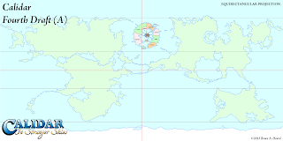
The World of Calidar, Fourth Draft World Map, Equirectangular Projection
FIXING CALIDAR'S GREAT CALDERA
This is the fourth draft of Calidar, designed by Bruce Heard.
It's a complete rethink of the map, giving the Great Caldera
the geographical isolation that it needed.  However, placing the
circular Great Caldera as is on this Equirectangular map did
not produce a perfect circle as it appeared to be.
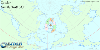
The Great Caldera, World of Calidar, Fourth Draft World Map, Stereographic Projection
Here's a Stereographic Projection of the same map.  You can see
how distorted the Great Caldera actually was.  Even though it looked
fine on the Equirectangular map, this is how it would have looked on
the globe.
 An Example Using G.Projector
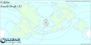
The World of Calidar, Fourth Draft World Map, Oblique Equirectangular Projection
The first step for fixing it was to load the map into G.Projector with
default settings.  Next, I changed the projection to Equirectangular
Oblique.  45ÂşN is about right, but the Caldera is slightly offset to
the east, so we also changed the map to 5ÂşE.  Note that the whole
central area of the map is essentially distortion free, so the longitude
nudge was not strictly necessary.

The World of Calidar, Fourth Draft World Map, Oblique Equirectangular Projection
I took the map into Photoshop and pasted in the circular Great
Caldera.  A couple of adjustments and it was done.  The next
step was to load it up in G.Projector again, which meant changing
the preferences to accept our map as Equirectangular Oblique,
centred on 5ÂşE, standard parallel 45ÂşN.  When loaded, the map
appeared very strange at first.  You have to manually change it
to Equirectangular Oblique, at which point it displays correctly.
The World of Calidar, Fourth Draft World Map, Equirectangular Projection
I entered latitude -45Âş to reverse the change we made before,
producing this map.  As you can see, it's a little messy, so we
used this as a guide to update the previous base map.
When you start G.Projector, it immediately asks you for a map.  By default, it expects this map to be in the Equirectangular Projection.  After you point it at your world map file, it then asks what coordinates the edges of the map show.  G.Projector is a bit limited when it comes to loading maps other than Equirectangular full world maps, so my advice is to always work with full world maps.  In that case, the default settings of 90ÂşN, 90ÂşS, 180ÂşW, 180ÂşE are perfect.

You can now reproject the map in any way you like.  G.Projector's list of projections is quite extensive.  Experiment and see what each projection looks like.

For building the base map, the projection we're interested in is Equirectangular Oblique.  Using the latitude and longitude controls, you can specify precisely where the map is centred.  For example, the default is 45Âş.  This centres the map on an oblique line beginning at 45ÂşN 0ÂşE, circling round to 45ÂşS. As a general rule, everything along the centre of the map (where the equator would be on a normal Equirectangular Projection) is free from distortion.  So if you want to draw a specific shape of terrain at 60ÂşN 35ÂşW, you should centre the map there.

Setting the latitude to 90Âş centres the map on the prime meridian.  You can choose a different meridian by changing the longitude setting.  This is great for working on the polar areas.  (Technically this is a Transverse Equirectangular Projection rather than an Oblique one, but the difference is purely terminology.)

Output maps centred on as many regions as you need, but be sure to note the settings used in the filename for each map.  You'll need this information later to reproject the map back to the base Equirectangular map.

Now use whatever image editing program you like to edit your map, only changing the central area of each map.

Loading non-Equirectangular maps, or even Equirectangular maps centred on a location other than 0ÂşN 0ÂşE, is a little clunky.  You will need to go into G.Projector's preferences and input the data there.  After you have changed these settings, load in your map, and you should be able to put it back to the original projection.

The final step is to use your adjusted map to update your base map.

G.Projector is limited to images around 10,000 or less pixels long, so you can't work with super high resolution images.

Also note that leaving the graticule (the grid lines) turned on when exporting the map can be useful, but when loading the map back in the lines can become very confusing.

I'm sure this has been pretty confusing.  Please give it a try for yourself, and see how it works.  If you get stuck, post in the comments below and I will see if I can help you out.


Roughen outlines
So you have your world looking just as you want it.  You've checked and rechecked using different projections.  You've set it as an image overlay in Google Earth and navigated around your world as a globe.

Once you're sure that it's all done, the next stage is to roughen up the continental outlines.  Mike Summers wrote a wonderful tutorial for this over at the Cartographer's Guild, or you can also see it on his blog.  I don't want to steal Mike's thunder, so I will leave the details for you to discover there.  I have used Mike's technique for all of Calidar's maps.

I like to roughen again at each level of detail, so I do it first at world level, then again at regional/continental level (4 times the resolution), and finally once more at local level (another 4 times the resolution).

And that brings us to the end of the continental outlines section.  If you managed to read this far, thanks!  There is actually one topic which I left out: scale.  I have decided that it deserves a post all of its own, so I will post it at a later date.

Please feel free to post any questions, comments, or corrections in the comments below.

Monday, 9 December 2013

Thorf's World-building Techniques: Introduction

Thorf's World-building Techniques: The Making of the World of Calidar
The Making of the World of Calidar
by Thorfinn Tait

For the past six months or so, I have been working on +Bruce Heard’s new project, the +World of Calidar.  Bruce brought me on board early on, first in an advisory role, then as Calidar’s official cartographer.  Working with Bruce is tremendous fun – in fact it’s nothing less than a dream come true, really.

Hex Map of Karameikos, 8 miles per hex, Mystara
Mystara Hex Map of Karameikos
Atlas of MystaraYou see, I grew up on the Known World and Mystara, and I was an avid reader of Bruce’s Voyages of the Princess Ark articles in Dragon magazine – not just the stories, but the specific combination of fiction with gazetteer info, and the all-important hex map that accompanied it.  Inspired by Mystara’s maps, I went on to create my own system for hex mapping, using Adobe Illustrator, and I have since recreated and updated almost all of Mystara’s published maps.  It’s through my Mystara Atlas project that I learned most of my cartographic skills and knowledge.


Hex Map of Bruce Heard's Alphatia: Floating Ar, 8 miles per hex, Mystara
Remake of Bruce's Floating Ar Hex Map
The Mystara community is friendly, civil, and just generally pretty wonderful, but the setting has been out of print for almost twenty years now.  For years, I have longed to work on a living and breathing setting.  With Bruce’s return to the industry last year, for a while it seemed like this may indeed come to pass, as he produced new articles and maps detailing Mystara’s continent of Alphatia.  However, the current rights-holders turned down Bruce’s licensing proposals, and the possibility faded.


Calidar: In Stranger SkiesHowever, in its place, like a phoenix rising from the ashes, the World of Calidar project was born.  For a Mystara fan, Bruce’s announcement was a bittersweet moment, but since then there has been no looking back.  I think it’s no secret that I am a huge fan of Calidar already.


So, getting back to the topic at hand, Bruce started sharing drafts of Calidar’s world map with me back in May.  Then in July, he tasked me with making maps of Calidar.  Since then, I have been working on all aspects of Calidar’s geography, in close collaboration with Bruce.


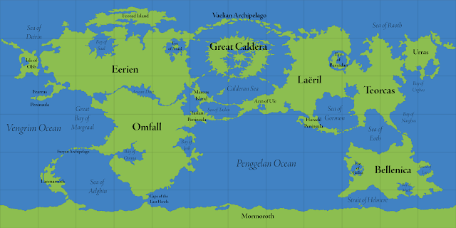
The World of Calidar, World Map, Equirectangular Projection
Calidar World Map, Equirectangular Projection
Climate Shading Test of the Great Caldera, Calidar
Great Caldera Climate-Shading Test
Mapping out the new World of Calidar has meant building a fantasy world from the ground up – or perhaps rather from space down.  Starting with the world map, then zooming in on one major continent, and finally zooming in one step further to deal with individual countries in that region, this project demands a number of different styles at various scales.  I’m most well-known for my hex maps, and while Calidar will of course have its own hex maps, these will be just one of a number of mapping styles – I have been expanding my cartographer’s toolkit greatly for this project.


Render of the World of Calidar with one of its moons, Kragdûr
Calidar with Kragdûr, one of its moons
I will be documenting all of these techniques in this series of making of tutorial articles.  I hope that the “making of” parts will be of interest to Calidar fans in general, while the tutorial parts should be of use to my fellow fantasy cartographers, from whom I have learned a great deal during my work on this project.


Planned sections include:
  • Continental Outlines
  • Base Height Field
  • Erosion
  • Climate Shading
  • Planetary Models
  • World Maps
  • Continental Maps
  • Hex Maps
The order may change, depending on which sections become ready for posting first.

Click here for the series index.