Showing posts with label projections. Show all posts

Monday, 11 August 2014

In Stranger Skies: An Insider's Review

 The skyship Star Phoenix flies low over Glorathon in the Kingdom of Meryath, Calidar: In Stranger Skies
First draft cover design, with art by Ben Wootten
A few hours ago, I completed and submitted the last tiny diagram for +Bruce Heard's Calidar: In Stranger Skies.  In Stranger Skies is the name of the first book for the +World of Calidar — hopefully the first of many more to come.  The layout phase is drawing to a close, and any day now Bruce will submit the book to the printers.

Now that my work on this book is done, I'd like to share my impressions of the project — an insider's review, so to speak.

I've seen a draft, and I have to say, it looks wonderful.  More importantly I have read through everything three times while proofreading, and the truth is that this is why I am so excited about the project: the writing.

Yes, I have been a fan of Bruce's writing and maps for more than twenty five years, and a member of the Mystara online community for seventeen of those, so sure, I'm biased.  But I'm also a picky and discerning reader.  I know what I like and what I don't like, and by extrapolation what is good and what is not.  (As always when it comes to opinions, your mileage may vary.)

Calidar is good.

I always enjoyed the Voyages of the Princess Ark series.  Every month I looked forward to its release, and indeed I bought Dragon solely for that one article.  The months when it didn't feature, I was not happy.  To be fair, I was also looking for articles for BECMI, but the Princess Ark was always my favourite.  Bruce's quirky humour and very current genre references made me smile every time, but the stories also served a purpose in introducing new areas.  The fiction brought everything to life, allowing readers to sample the flavour of a culture, which made the gazetteer sections all the more interesting.

I guess you could say I'm a fan of this rather unique pairing of fiction and gazetteer.

Well, the thing is, Bruce's writing style has matured and improved over the last twenty years.  In Stranger Skies is very much the spiritual successor of the Princess Ark, and there are many similarities.  Some will undoubtedly call it a reboot, although I wouldn't go that far myself.  You see, it's much more than just a reboot: it's a whole new thing of its own.

With Calidar, Bruce has created a whole new universe with its own themes and tropes.  It has some very interesting themes and plot devices built into the story and the setting, such as the Vortex, which allows a limited form of travel between realities; world souls as a source of magic and life; skyships and space travel, including multiple ways to travel the Great Vault; as well as some rather interesting dynamics which shape the relationship between mortals and their gods.

Calidar: In Stranger Skies, Great Caldera, Araldûr, dwarf, Kragdûras, fantasy map
An excerpt from the Great Caldera poster map.  Bruce came
up with a new language, Kragdûras, for the names.
You can see some of this in the short stories which Bruce has already released — and if you haven't already read them, you should — but it'll become apparent just how much there is when you read the main story and its gazetteer.

I would be remiss if I didn't mention another of Bruce's talents: he is great at coming up with names.  Any Mystara fan can attest the linguistic richness and logic of place names in Mystara.  It's no secret how he does this, by adapting real world place names, but it's also something that's very hard to get just right.  For me, as a Tolkien fan as well as a Mystara fan, I have been completely spoiled with great place names, and it's something that continually holds me back from enjoying many other fantasy worlds.  I'm sure I'm pickier than most in this regard, but suffice it to say that Calidar's names just fit.

So yes, the story is wonderful, and the gazetteer section is great.  In fact my only complaint about them both is that they're too short, and left me wanting much, much more!

John Dollar art Calidar: In Stranger Skies Gumboyle Moffeecot Mama Goo
Art by John Dollar showing the ship's cook — sure to be a fan favourite.
Moving on to other parts of the book: the art is sumptuous.  A total of four artists contributed to the book: Ben Wootten painted the cover art; John Dollar and Savage Mojo did interior art; and Pierre Carles drew the astrolabe which has become the Calidar Publishing logo.  All of these artists have contributed wonderfully to the look and feel of In Stranger Skies and indeed the whole World of Calidar.

Calidar: In Stranger Skies, Great Caldera, Kingdom of Meryath, Glorathon, Royal Domain, topographical map, fantasy map
My new topographical style in its most zoomed in form.
Obviously when it comes to the maps I am totally biased, but I hope you will enjoy them, too.  As my blog's subtitle suggests, I have made every effort to make Calidar's maps as accurate and consistent as possible.  Every town and city has its own latitude and longitude coordinates, and there is even a special coordinate system for each planet in the Soltan Ephemeris.  I have tentatively called Calidar's "Calidar 2014", although perhaps "Calidar 1512" would have been more appropriate.  You can see these things in the maps with graticules (latitude/longitude grid lines).

I have also developed my own original style for Calidar's topographical maps, which you can see on the Great Caldera poster map, as well as the in-book Kingdom of Meryath map, and the local map of Glorathon's Royal Domain.

Calidar: In Stranger Skies, Great Caldera, Kingdom of Meryath, hex map, fantasy map
Close-up of the Meryath poster map, with all new hex art.
For fans of hex maps, the bonus poster map shows the Kingdom of Meryath in glorious hex format.  It's 100% compatible with all the other maps.

I chose an appropriate projection for each of the maps: Stereographic for the Great Caldera, to show its shapes undistorted; Equirectangular for the world maps, to provide a familiar view; Albers Equal Area for the Meryath maps, including the hex map, to facilitate demographic calculations; and so on.

Of course, none of this matters if you just want to enjoy the maps for what they are.

Looking at everything together, I truly believe that Calidar: In Stranger Skies is a great product.  I am seriously looking forward to talking Calidar with all of you in the coming weeks and months.

You can bet I'll keep you updated on the release schedule.

Thanks for reading!

Wednesday, 11 December 2013

World-building: Continental Outlines and Map Projections

Thorf's World-building Techniques: The Making of the World of Calidar
This is the second article in a series.
Click here for the series index.
The first step in creating a whole world is to create a set of continental outlines.  There is good reason to make this the first step: at this point, it's a simple matter to make tweaks and adjustments until you have things looking just the way you want.  The further you progress through your world-building project, the more troublesome this will become, so that later on even a minor tweak may potentially require time-consuming revisions to be made throughout your work.

To sum up: now is the time to try things out, reject what you don't like, keep what you do, and most importantly keep tweaking until you get things just right.

Concepts
Before we get started, there are some things to bear in mind when creating our world map.  First and foremost, the world map is necessarily an extremely small scale map.  Consequently, it cannot show your world in very high detail; nor does it need to.  In many respects, world maps are vague and inaccurate.  They simply lack the kind of resolution needed to display high levels of detail.  In layman's terms, they are just too far zoomed out to see much more than general shapes.

What this means is that your world map is your base map, upon which all other maps are based, but regional and local maps do not have to reflect it 100%.  On the contrary, they should develop and expand upon the foundations contained in the world map, introducing new details too fine to show up on it, as well as revising and enhancing those details that did appear on the world map.
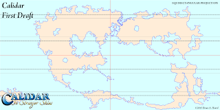
The World of Calidar, First Draft World Map, Equirectangular Projection
+Bruce Heard's very first design for Calidar's world map.  Note 
how the Great Caldera is already present, but joined up with the 
adjacent continents.  This map was drawn directly onto a 2:1 
Equirectangular Projection using Paint.NET.  The resolution 
was 6000 x 3000.
Generally, regional maps will be created by cropping your world map, then resampling to a higher resolution.  Local maps can then be done in the same way, based on regional maps.  With Calidar, I increase resolution by a factor of four for regional maps, then increase by a factor of four again for local maps.

If you deem it necessary, the world map can be rebuilt later to reflect the more detailed regional maps, but this should be considered strictly optional.  There is probably not a lot to be gained by doing so, as the lower resolution of the world map will obscure the added details anyway.  In general, world maps should remain reasonably simple and unburdened with tiny details, to fulfil their main purpose as overview maps.

Software
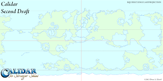
The World of Calidar, Second Draft World Map, Equirectangular Projection
Bruce's second draft incorporated impact craters throughout the
world, so that there were numerous areas like the Great Caldera.
It also split the Great Caldera from its neighbouring continents.
When it comes to drawing the actual outlines, pretty much any paint software will do - raster or vector.  Personally I like Adobe Illustrator's vectors for this stage, but Adobe Photoshop or an equivalent raster editor is just as effective.  You can go back and forth between raster and vector using auto-trace when necessary.

The reason for this is that at this stage, only the general shapes are important; small details on the coasts can be added later, so there's no need to worry about things looking too regular.
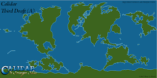
The World of Calidar, Third Draft World Map, Equirectangular Projection
I took a stab at the third draft, tracing Bruce's outlines to Illustrator
vectors.  I went back to the first draft and tried to split things up to
look more earth like.

It's worth noting here briefly the differences between raster and vector art.  Raster graphics, also known as bitmaps, are comprised of arrays of tiny dots known as pixels.  Most people are familiar with these images from photographs, paint programs, and indeed the Internet.  Common formats are PNG, JPG, and GIF.  Photoshop and most other paint programs mostly work with raster images.  Raster images can often be shrunk down without incurring great problems, but enlarging them causes them to become blocky and/or blurry, and is best avoided.  This means that you need to consider what resolution to work in from the start, because you won't be able to increase it later on.
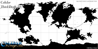
The World of Calidar, Third Draft World Map, Equirectangular Projection
My last attempt.  Note how we worked in a range of colour schemes;
at this stage in the design, working with whatever's easiest for you is fine.
Although these drafts were all ultimately rejected, you can see elements
of the final design slowly appearing.  At this stage, Bruce realised that the
design had wandered away from the central concept of the Great Caldera
being a safe haven, isolated from the Dread Lands around about, and we
went back to the drawing board.
Vector graphics, in contrast, are made up of mathematical descriptions of lines and points.  They don't use pixels at all, although they can be rasterised – i.e. changed into pixel arrays.  Because they are defined using lines and points, it's possible to resize them freely without losing sharpness.  Fonts are probably the most common vector graphics encountered in daily life.  Illustrator works primarily with vector graphics.  Vector formats include SVG, DXG, AI, and many others.

In Calidar’s case, Bruce worked with PNG raster images in Paint.NET.  I then auto-traced those images in Illustrator, turning them into vectors, before making adjustments and exporting to PNG to send back to Bruce.  I prefer vectors for coastlines, but lately I have been using high resolution raster PNG files more and more, because it's easier to roughen coastlines on a raster image.

Projections
Images in this section are courtesy of USGS.  Check their Map Projections Poster for a full description of all the concepts in this section.
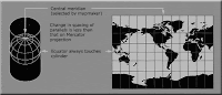

Miller Cylindrical Projection
Miller Cylindrical
Planets are three dimensional objects: spheres, or more accurately ellipsoids.  Maps, on the other hand, are flat two dimensional representations.  When you make a two dimensional representation of a three dimensional planet, distortion of some kind is unavoidable.
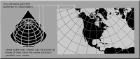
Lambert Conformal Conic Projection
Lambert Conformal Conic
In order to create a flat map from an ellipsoid, a projection is needed.  There are various kinds of projection, depending on how coordinates on the ellipsoid are mapped to coordinates on the map.  The three basic types are cylindrical, conic, and azimuthal.  There are other types; for example, pseudocylindrical projections are commonly used for presenting world maps in modern atlases.
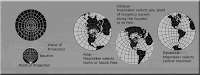
Stereographic Projection
Stereographic (Azimuthal)
It’s important to understand that no projection can accurately represent every property of an ellipsoid.  All projections introduce distortion of some kind.  In fact, each projection can generally only preserve one or two properties.  This is what guides the choice of projection for each map.

Properties that can be preserved include:

• Shape
• Area
• Distance
• Direction
• Bearing
• Scale

Of these, shape, area and distance are probably the most important, and projections that preserve them are the most well-known and widely used.
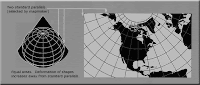
Projections preserving shape are known as Conformal Projections.  Examples include Mercator, Stereographic, and Lambert Conformal Conic.
Albers Equal Area Projection
Albers Equal Area

Those which preserve area are called Equal Area Projections.  Examples include Gall-Peters, Albers Equal Area, Lambert Azimuthal Equal Area, as well as Mollweide and Hammer.


Sinusoidal Projection
Sinusoidal
Equidistant is the name for distance-preserving projections.  Examples include Equirectangular, Azimuthal Equidistant, and Sinusoidal.


Robinson Projection
Robinson
A fourth kind of projection that sees a lot of use is the category of Compromise Projections.  These projections don’t preserve any property perfectly, instead aiming to strike a balance between distortions in multiple properties.  Examples include Robinson, Van der Grinten, Miller, Winkel Tripel, and Dymaxion.
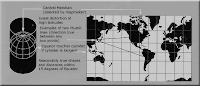
Mercator Projection
Normal Aspect Mercator
Transverse Mercator Projection
Transverse Aspect Mercator
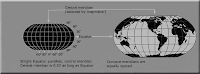
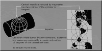
Finally, another important property of projections is their aspect.  There are three aspects: normal, transverse, and oblique.  Aspect refers to the orientation of the base plane of the projection to the ellipsoid.  Normal aspect means that it is aligned with the “normal” view of the planet.  In the case of a cylindrical projection, it’s easy to imagine the earth inside a vertical tube, with the tube touching the cylinder at the equator.  Transverse means that the cylinder is horizontal, touching a meridian instead of the equator.  Transverse projections are therefor at a 90º angle to normal projections.  Oblique means that it is angled somewhere between normal and transverse, which means that the cylinder doesn’t correspond to any parallel or meridian.
Oblique Mercator Projection
Oblique Aspect Mercator

Further reading on projections:
• Map projections at Wikipedia
• Map Projections Poster at USGS
• How to choose a projection at Hunter College (highly recommended!)
• G.Projector User's Guide: Projection List

Advantages of Projections
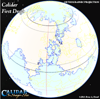
The World of Calidar, First Draft World Map, Google Earth Orthographic Projection
Bruce's original world map design as an
image overlay in Google Earth
If you don’t care about projections, you’re good to go - draw your world map in whatever shape you like, and stick with it.  Many fantasy cartographers do just this, and produce stunning works of art without ever worrying about what projection the map is in.  There’s nothing wrong with this approach – we are dealing with fantasy, after all.  All fantasy cartographers sacrifice some aspect or other in order to produce maps in a reasonably timely fashion, and I would hate to force my style on someone else just for the sake of “accuracy”.

With that said, there are quite a few advantages to using projections in your maps, should you wish to do so.  For example, you will be able to:

• Take advantage of reprojection techniques to design good-looking polar areas, avoiding distortion and spikiness.
• Produce multiple versions of your world map, choosing a projection to match the theme of each.
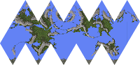
The World of Calidar, Icosahedral Net
Icosahedral net made in Fractal Terrains
using an Equirectangular height map
• Choose suitable projections to show each region of your world in its “true” shape.
• Take advantage of the properties of each projection in your maps.
• Place your map on a 3D model such as Google Earth.
• Create icosahedral maps or interrupted (segmented) projection maps to make paper globes.
• Make animated spinning planets using Photoshop’s 3D, or a 3D rendering program such as Bryce.
• Render impressive orbital views and space scenes.
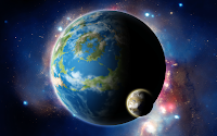
Render of the World of Calidar with one of its moons, Kragdûr
Orbital view rendered in Photoshop using
Equirectangular planet and moon maps
Some of these things are possible to do without using projections, but results will vary depending on the characteristics of your map.  And if you’re anything like me, the “inaccuracy” of such an approach will likely bother you, and take away from the final maps.

For Calidar, we decided from the very start to work with projections.  I had long wanted to do so with my work on Mystara, but was held back by the choices of Mystara’s original cartographers back in the 1980s.  This is not a criticism - on the contrary, I have the utmost respect for all of the cartographers who worked for TSR, and they have undoubtedly influenced me more than anyone else.  Of course, TSR's cartographers did not have access to the kinds of computers and software that we do today, so their job was that much harder.

Working with Projections
Before computers became so ubiquitous as they are today, cartographers were forced to make difficult calculations, or to use complex tables to convert maps from one projection to another.  These days, however, there is freeware software to do this for us.

The most useful I have found is NASA’s G.Projector.  There is also QGIS, but it’s much more complicated and harder to use.

If you want to take full advantage of projections, there are various commercial software options to choose from too.  I use Manifold, which is one of the more affordable programs.  I would love to be using Avenza Systems Inc.’s MAPublisher and Geographic Imager, which enable projection and other GIS functions directly within Illustrator and Photoshop respectively, but both are well out of my price range.

Whatever software you choose, you will need to learn how to load images into it, georeference them if necessary, change projections, and then export back to your usual image format.

Projections and the World Map
For various reasons, the best projection to work with for your world map is the Equirectangular Projection.  Also known as Geographic Projection, Plate Carrée, or Latitude/Longitude Projection, it is nothing more than a simple grid of latitude and longitude.  This inherent simplicity makes it a relatively easy projection to work with.  But it’s important to know its strengths and shortcomings.

Equirectangular Projection
+ Simple grid of latitude by longitude, giving a 2:1 ratio image.
+ The required projection for Google Earth image overlays and texturing 3D models.
+ Up is always north, left is always west, etc.
+ Low north-south distortion of shapes.
+ North-south distances are accurate throughout the map.
- High east-west distortion of shapes, progressively increasing as you move away from the equator.
- Poles are stretched across the entire length of the map, making the polar regions difficult to work with.
- East-west distances are accurate only along the equator, and difficult to measure accurately elsewhere.

The World of Calidar, First Draft North Pole, Google Earth Orthographic ProjectionThe World of Calidar, First Draft South Pole, Google Earth Orthographic Projection
Google Earth image overlays showing the original designs for Calidar's north and south poles.
The results were somewhat less than stellar.  Due to this distortion, we all but abandoned polar 
landmasses in the second draft.  It wasn't until the fourth draft that we tackled the problem, 
with the help of G.Projector and the Oblique Equirectangular Projection.

In terms of creating continental outlines, the main problem we have to deal with is the distortion of the polar areas.  This is actually easy to solve, and you don’t even need to use a different projection to do so.  Think about it for a moment: in an Equirectangular Projection, the equator area is relatively distortion-free.  But why does the map have to be centred on the equator?  In fact, it doesn’t.  When you centre the map on a different parallel (or meridian!), it’s known as an Oblique Projection.  What this means is that we can reproject the map to an Oblique Equirectangular Projection, so that the poles are relatively undistorted.

The same is true of any areas which need to be very specific shapes.  For example, with Calidar, there are various impact craters around the world.  All of these needed to be circular.  It’s possible to do this simply by centring the Oblique Projection on the area of interest.

The important thing to bear in mind here is that the goal is to create a single base map.  So everything that is done in a different projection must be reprojected back to the original projection, and then used as a guide to update the base map.

Using these techniques, it’s possible to build up a world which looks exactly as you want it to look.
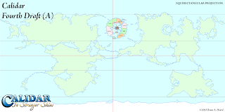
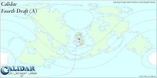
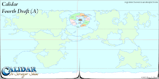
The World of Calidar, Fourth Draft World Map, Equirectangular Projection
FIXING CALIDAR'S GREAT CALDERA
This is the fourth draft of Calidar, designed by Bruce Heard.
It's a complete rethink of the map, giving the Great Caldera
the geographical isolation that it needed.  However, placing the
circular Great Caldera as is on this Equirectangular map did
not produce a perfect circle as it appeared to be.
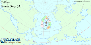
The Great Caldera, World of Calidar, Fourth Draft World Map, Stereographic Projection
Here's a Stereographic Projection of the same map.  You can see
how distorted the Great Caldera actually was.  Even though it looked
fine on the Equirectangular map, this is how it would have looked on
the globe.
 An Example Using G.Projector
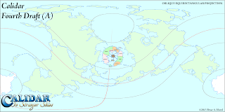
The World of Calidar, Fourth Draft World Map, Oblique Equirectangular Projection
The first step for fixing it was to load the map into G.Projector with
default settings.  Next, I changed the projection to Equirectangular
Oblique.  45ºN is about right, but the Caldera is slightly offset to
the east, so we also changed the map to 5ºE.  Note that the whole
central area of the map is essentially distortion free, so the longitude
nudge was not strictly necessary.

The World of Calidar, Fourth Draft World Map, Oblique Equirectangular Projection
I took the map into Photoshop and pasted in the circular Great
Caldera.  A couple of adjustments and it was done.  The next
step was to load it up in G.Projector again, which meant changing
the preferences to accept our map as Equirectangular Oblique,
centred on 5ºE, standard parallel 45ºN.  When loaded, the map
appeared very strange at first.  You have to manually change it
to Equirectangular Oblique, at which point it displays correctly.
The World of Calidar, Fourth Draft World Map, Equirectangular Projection
I entered latitude -45º to reverse the change we made before,
producing this map.  As you can see, it's a little messy, so we
used this as a guide to update the previous base map.
When you start G.Projector, it immediately asks you for a map.  By default, it expects this map to be in the Equirectangular Projection.  After you point it at your world map file, it then asks what coordinates the edges of the map show.  G.Projector is a bit limited when it comes to loading maps other than Equirectangular full world maps, so my advice is to always work with full world maps.  In that case, the default settings of 90ºN, 90ºS, 180ºW, 180ºE are perfect.

You can now reproject the map in any way you like.  G.Projector's list of projections is quite extensive.  Experiment and see what each projection looks like.

For building the base map, the projection we're interested in is Equirectangular Oblique.  Using the latitude and longitude controls, you can specify precisely where the map is centred.  For example, the default is 45º.  This centres the map on an oblique line beginning at 45ºN 0ºE, circling round to 45ºS. As a general rule, everything along the centre of the map (where the equator would be on a normal Equirectangular Projection) is free from distortion.  So if you want to draw a specific shape of terrain at 60ºN 35ºW, you should centre the map there.

Setting the latitude to 90º centres the map on the prime meridian.  You can choose a different meridian by changing the longitude setting.  This is great for working on the polar areas.  (Technically this is a Transverse Equirectangular Projection rather than an Oblique one, but the difference is purely terminology.)

Output maps centred on as many regions as you need, but be sure to note the settings used in the filename for each map.  You'll need this information later to reproject the map back to the base Equirectangular map.

Now use whatever image editing program you like to edit your map, only changing the central area of each map.

Loading non-Equirectangular maps, or even Equirectangular maps centred on a location other than 0ºN 0ºE, is a little clunky.  You will need to go into G.Projector's preferences and input the data there.  After you have changed these settings, load in your map, and you should be able to put it back to the original projection.

The final step is to use your adjusted map to update your base map.

G.Projector is limited to images around 10,000 or less pixels long, so you can't work with super high resolution images.

Also note that leaving the graticule (the grid lines) turned on when exporting the map can be useful, but when loading the map back in the lines can become very confusing.

I'm sure this has been pretty confusing.  Please give it a try for yourself, and see how it works.  If you get stuck, post in the comments below and I will see if I can help you out.


Roughen outlines
So you have your world looking just as you want it.  You've checked and rechecked using different projections.  You've set it as an image overlay in Google Earth and navigated around your world as a globe.

Once you're sure that it's all done, the next stage is to roughen up the continental outlines.  Mike Summers wrote a wonderful tutorial for this over at the Cartographer's Guild, or you can also see it on his blog.  I don't want to steal Mike's thunder, so I will leave the details for you to discover there.  I have used Mike's technique for all of Calidar's maps.

I like to roughen again at each level of detail, so I do it first at world level, then again at regional/continental level (4 times the resolution), and finally once more at local level (another 4 times the resolution).

And that brings us to the end of the continental outlines section.  If you managed to read this far, thanks!  There is actually one topic which I left out: scale.  I have decided that it deserves a post all of its own, so I will post it at a later date.

Please feel free to post any questions, comments, or corrections in the comments below.

Thursday, 5 December 2013

Maps of the Day 10-13: Eerien

To the west of the Great Caldera lies the vast continent of Eerien.
Eerien, Calidar, Equirectangular and Lambert Conformal Conic Projections
Eerien, Equirectangular and Lambert Conformal Conic Projections
The top map is an extract from the world map, showing a little more than a quarter of the map, from the Great Caldera in the east to the Isle of Obb in the west, and from Feorad Island in the north, down to Omfall straddling the equator.  From north to south this area is 10,800 km (6,750 miles), and along the equator it's a little over 25,800 km (16,125 miles).  The top line of the map is of course a single point, being the north pole.

Points of interest include a warped view of Feorad Island (compare it with the Lambert Conformal Conic views in the Feorad article to see what a huge difference the projection makes); the positioning of the Great Caldera in regard to the surrounding terrain; the northern part of Omfall, another huge continent which stretches down to the Antarctic Circle; the Aesean Duct, a narrow sea passage bisecting the two great continents; and of course Eerien herself.

Eerien is home to Calidar's tallest mountains, its highest peak reaching a towering 8,925 m (29,281 feet).  As such, the mountain design is of great importance.

The bottom image shows the true shape of Eerien, projected onto a shape-preserving Lambert Conformal Conic Projection.

The next images show the progression of Eerien's pre-erosion height map design.  This is currently the most developed area outside of the Great Caldera, although other parts of the world are slowly catching up.
Eerien height maps and 3D views, Calidar, Lambert Conformal Conic Projections
Eerien, Lambert Conformal Conic Projection
The top and bottom images are 3D views of Eerien, looking north from a point high above Omfall.  Although they are 3D views, the curvature of the world is not shown, though 3D view of Eerien on the surface of the globe is in the works for a later date.

The top image is a preview of the design, straight from Photoshop.  If you look closely, you should be able to make out that the mountains are all roughly the same height throughout the map - legions of white peaks everywhere.  Eerien is supposed to be extremely mountainous, but we wanted to introduce some variation to the heights.  Considering the sheer size of the base map – a staggering 22,737 × 14,049 pixels – it's not that easy a thing to fix.

However, I came up with an idea, which you can see in the middle image.  It's an adjustment mask which I applied to the base map.  There is a single pure white spot, which remains at full height.  All the rest are increasingly darker shades of grey, which pushed down the height of the mountain peaks under them.  This was all painted manually, and finally blurred before being applied to the height map.

The bottom image shows the result.  At first glance you may be wondering what the big deal is, but look closely and you should be able to see quite a lot of variation has been introduced into the mountain ranges.

One last point: did you notice all the pillars scattered across the bottom image?  These are there for a specific purpose, and of course are only there as temporary markers.  Would you like to hazard a guess as to what they are marking?  Hint: there are lots of them due to the sheer size of the map.

The answer is that they are scale markers, to help keep all the altitudes in sync.  There are lots of them because the map is split up into smaller parts for erosion, and each part must have a marker on it.  The height of the markers is 8,925 m, and on the height map they are pure white, marking the top of the world.

Without these markers, the programs which handle the height maps would make the highest height on each map white, and scale the rest accordingly.  That would mean mountains of 8,925 m all over the world!

he next image shows two renditions of the same height map.  I'm sure you'll agree that the colour version is much easier to read, but unfortunately when I need to make manual changes to the map, I generally have to work on the black and white version.  It's tricky, to say the least.

Eerien, Calidar, height maps, Lambert Conformal Conic Projection
Eerien Eroded Height Map, Lambert Conformal Conic Projection
This is the second draft of Eerien.  In order to perform erosion on this massive continent, I had to split it up into six different sections, each up to 9,999 x 9,999 pixels.  Of course the sections had to overlap, or putting them together would have been very difficult, since rivers would run in completely different courses.

Eerien's erosion has resulted in some very interesting terrain.  My favourite part is the plateau, which has gained a Grand Canyon-like ravine.  Immediately north of the plateau are the highest mountains in the world, so it's a fascinating area all round.
Eerien, Calidar, 3D views of eroded terrain, Lambert Conformal Conic Projection
3D Views of Eerien, Lambert Conformal Conic Projection
In this last image, we present five different 3D views of Eerien's terrain.


At the top you can see the continent in its entirety.


The middle row shows two different perspectives on Calidar's version of the Himalaya Mountains and the Tibetan Plateau.  These are the highest mountains in the world, although it may be difficult to see that at these distances.

The plateau itself is not entirely flat, with its most predominant feature being the massive ravine which snakes its way through.  Presumably all the runoff from the mountains to the north has carved this huge scar into the plateau over many aeons.

Finally there is a closer look at the lowlands to the north of the great mountains, and then a look at the imposing mountains themselves from nearby.

That's it for Eerien for now.  As the Kickstarter start date approaches, we will continue to reveal the World of Calidar.


Monday, 2 December 2013

Map of the Day 14: Mormoroth

Welcome to the third week of daily Calidar maps.  This week we continue our world tour, with a new continent each day – beginning with the south polar continent of Mormoroth.
Mormoroth: Calidar's South Pole, 3D View of Eroded Height Map, Polar Stereographic Projection
Mormoroth, 3D view of Eroded Height Map, Polar Stereographic Projection

Mormoroth: Calidar's South Pole (First Draft), Polar Stereographic Projection
First Draft, Polar Stereographic


Mormoroth: Calidar's South Pole (Second Draft), Polar Stereographic Projection
Second Draft, Polar Stereographic
As I have mentioned in previous posts, the polar areas can be the most problematic for any world builder.  This is because it is easy to draw onto a rectangular world map – which of course warps the poles more and more until the top and bottom lines of the map represent the points of the poles.
Mormoroth: Calidar's South Pole (First Draft), Equirectangular Projection
First Draft, Equirectangular
Mormoroth: Calidar's South Pole (Second Draft), Equirectangular Projection
Second Draft, Equirectangular

Calidar was no different, and the polar regions caused so much trouble that at one point we considered simply having no land in these regions of the map at all.  However, in the end we used map projections to solve the problem.  The result is the design you see on the left.

The small strip below each Polar Stereographic map is the bottom strip of the Equirectangular world map, from 90ºS to 60ºS.  In other words each of the above pairs of images displays the same area.  Note how the first draft coastline design looks smooth on the Equirectangular map, and yet hideously spiked on the Polar Stereographic map.

What I did was to redraw the coastline on the Polar Stereographic map, resulting in the second draft image on the right.  Then I reprojected the new design back to Equirectangular, and slotted it in to the world map – as you will see perhaps next week.
Mormoroth: Calidar's South Pole, Mountain Design
Mountain Design
Polar Stereographic Projection
(Cropped for erosion)

With the projection issues sorted, I'm sure you all know by now what came next: mountain designs, followed by erosion.  After Bruce gave me the okay on the new coastlines, I had to adapt the mountain design to it, then work on the height map.

The funny thing about Mormoroth is that since it lies at the south pole, most of the height map design will not be visible on any map – it will all be buried in a massive ice sheet, with only the highest mountains sticking out the top.

Undaunted by this, I went ahead and developed the area anyway.  I have yet to work out how to implement the ice sheet itself...  In the meantime, here are some views of the eroded height map – a peek beneath the ice sheet, if you like.

Mormoroth: Calidar's South Pole, Eroded Height Map

Mormoroth: Calidar's South Pole, 3D View of Eroded Height Map

Mormoroth: Calidar's South Pole, 3D View of Eroded Height Map

Join me again tomorrow as we journey north again to one of Calidar's undiscovered continents.

Saturday, 30 November 2013

Map of the Day 9: Feorad Isle

Welcome to week two of Map of the Day–the Calidar World Tour!
Feorad Isle, Calidar's northernmost land, Lambert Conformal Conic Projection
Feorad Isle – Calidar's northernmost land, Lambert Conformal Conic Projection

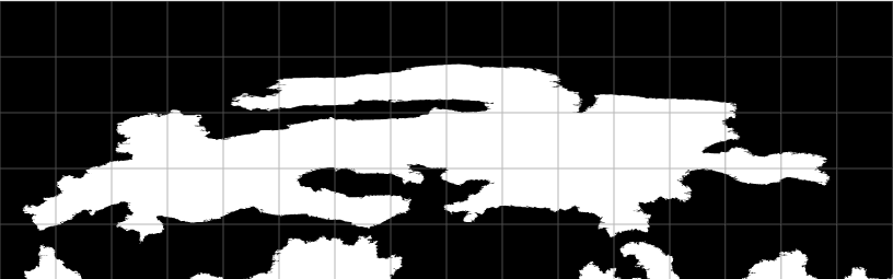
Feorad Isle, Calidar's northernmost land, Equirectangular Projection
Feorad Isle, First Draft
Equirectangular Projection
Feorad Isle, Calidar's northernmost land, Lambert Conformal Conic Projection
Feorad Isle, First Draft
Lambert Conformal Conic Projection
We begin our world tour this week with a look at the top of the world–the north pole.  There is no land at the pole itself, but there's an island close to it, which is known as Feorad Isle.  It's likely a cold, mostly frozen land, the vast majority of which lies firmly within the Arctic Circle – which on Calidar lies at 66.5ºN.

Continuing last week's discussion of projection problems, the north and south polar areas of any world pose a particularly thorny problem for world builders working with a rectangular base map, such as the Equirectangular Projection.  The problem is that areas north of 60ºN and south of 60ºS are stretched progressively more and more, until the single point of a pole is represented by the whole top or bottom edge of the map.

Feorad Isle, Calidar's northernmost land, Lambert Conformal Conic Projection
Feorad Isle, Second Draft
Lambert Conformal Conic Projection
Draw landforms in the normal way, and they will invariably end up spiky and squashed-looking.  You can see this in the first draft images on the left.  The solution is to reproject the map to a more suitable projection, and design the area using that projection.  Later, this can be projected back to Equirectangular and added back in to the base map – where of course it will now look stretched, but that's as it should be on that projection.

Feorad Isle, Calidar's northernmost land, Equirectangular Projection
Feorad Isle, Second Draft
Equirectangular Projection
The second draft black and white images show the fixed coastlines, first edited on a Lambert Conformal Conic Projection, then reprojected back to the base Equirectangular Projection.

It's important to consider projections when designing terrain, too, because otherwise the terrain will end up just as warped as the coastlines here were.  This is why each of Calidar's continents has been designed using a projection chosen for that continent.  The Great Caldera is circular, and away from the equator, so it uses the Stereographic Projection.  Feorad Isle is close to the north pole, and so could use Polar Stereographic, but the other side of the pole is uninteresting, with no land, so instead I chose the Lambert Conformal Conic, whose shape is very efficient in this case.


Feorad Isle, Calidar's northernmost land, mountain design, Lambert Conformal Conic Projection
Mountain Design
Lambert Conformal Conic Projection
Looking at these images again, I wonder if perhaps I have gone a little too far in reducing the spikiness of the terrain.  What do you think?  Please let me know in the comments.

After the coastlines have been fixed, it's time to build a height map, working from +Bruce Heard's mountain design.  In this case, the design was squished by the projection change, so it required quite a bit of tweaking; working in an appropriate projection is important not just for coastlines, but also for terrain design.  Even a long mountain range painted onto the Equirectangular projection maps above will be squashed down to a much shorter one when reprojected into Lambert Conformal Conic – or onto a globe.


Feorad Isle, Calidar, satellite view, pre-erosion terrain design, Lambert Conformal Conic Projection
Pre-erosion terrain design–satellite
Feorad Isle, Calidar 3D view, pre-erosion terrain design, Lambert Conformal Conic Projection
Pre-erosion terrain design–3D view


Once the base height map has been designed, it's time for simulated erosion.  In the 3D views here you can see the map in its initial design stage, then in its finished stage.  Note the very distinctive valleys carved into the land, and also how the blobby orange hills turn into sculpted peaks.


Feorad Isle, Calidar, satellite view, post-erosion terrain design, Lambert Conformal Conic Projection
Post-erosion terrain design–satellite
Feorad Isle, Calidar 3D view, post-erosion terrain design, Lambert Conformal Conic Projection
Post-erosion terrain design–3D view


As with the black and white coastline maps, the finished height maps are reprojected into Equirectangular form and added to the world map.  In this way, the world map is slowly taking form. Once its complete, we'll be able to produce accurate maps of any section of the world in whatever projection is needed.


Next time on our world tour, we will journey southwards to one of Calidar's biggest continents of all.