There are two stages to building a height map of your world: first you make the base height field, then you put it through the erosion process. This article covers the first of these stages. A separate article on erosion is also in the works.
Software
How you go about making your base height field depends largely on what software you have available. I use Adobe Photoshop, but my techniques should also be possible in
GIMP, which is a free alternative to Photoshop.
You can find lots of tutorials for Photoshop (as well as GIMP) over at the
Cartographer's Guild. I have consulted a large number of tutorials at the Guild in the course of this project, for which I am very thankful, and the Guild members are a very helpful and friendly group. I highly recommend joining and posting there when you are in need of help or advice.
My method uses image editing software rather than height map editing software, but it's also possible to generate various kinds of random height maps using a fractal or height map editing program.
Fractal Terrains and
Wilbur, both by Joe Slayton, are among the best of these. Fractal Terrains is available from
ProFantasy, while Wilbur is free. We will return to both of these programs for other uses later in this series. Other options include
Leveller,
World Machine, and
Bryce.
The problem with all of these programs is a certain lack of control: the random element can get in the way, preventing you from generating terrain the way you want it to look. Having said that, it's obviously a lot easier and faster to go with random terrain, so if it suits your purposes, go for it.
For this series of tutorials, we are starting this stage with pre-designed continental outlines, so Photoshop is our tool of choice.
What is a Height Field?
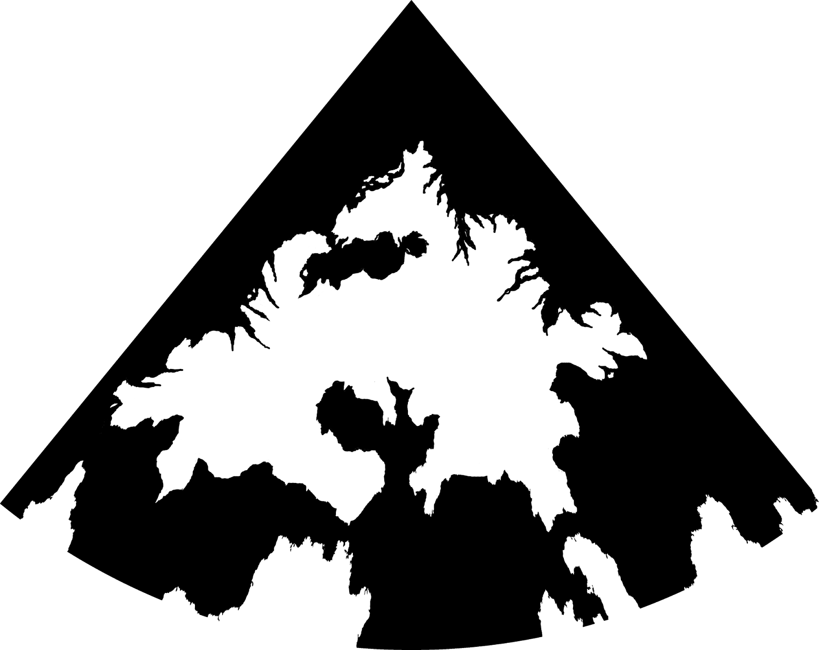
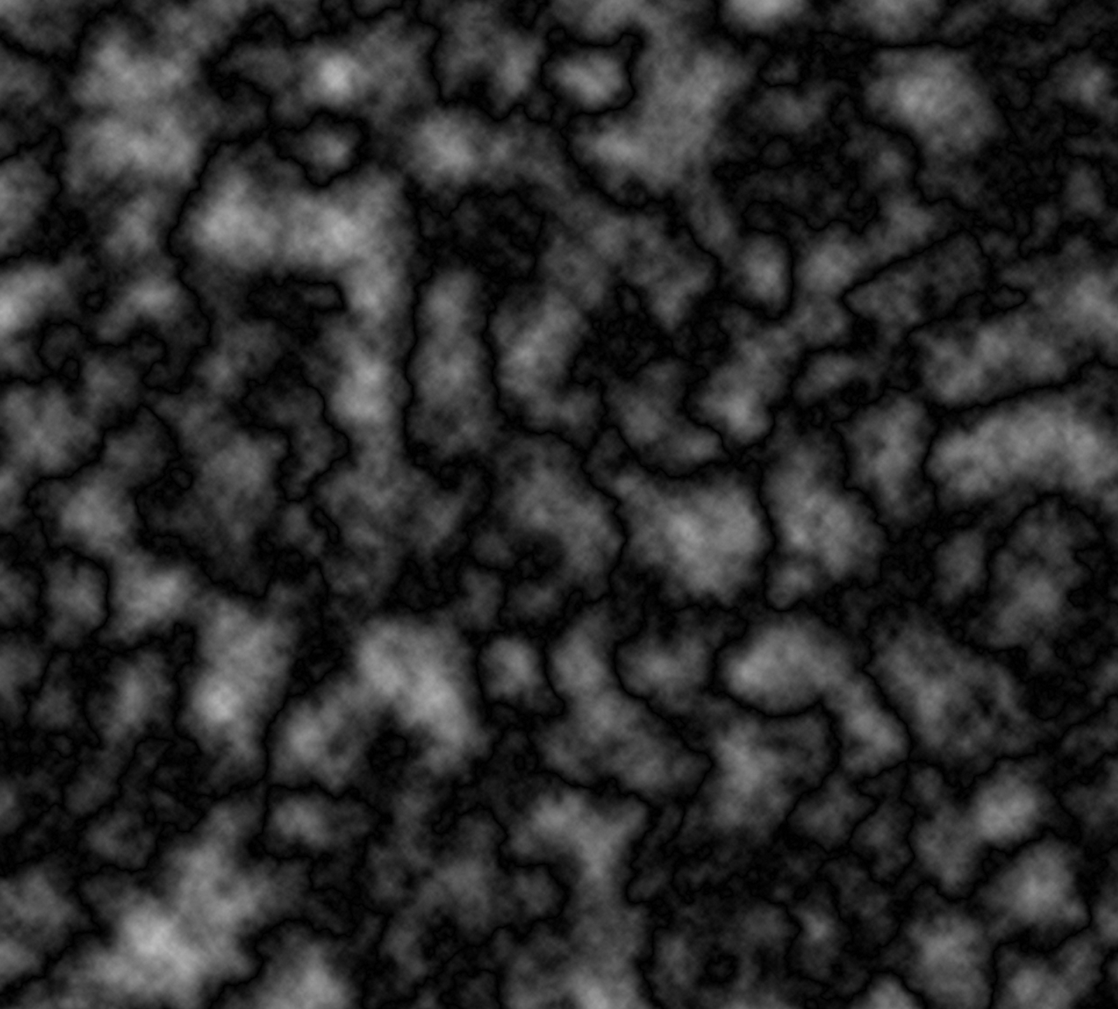
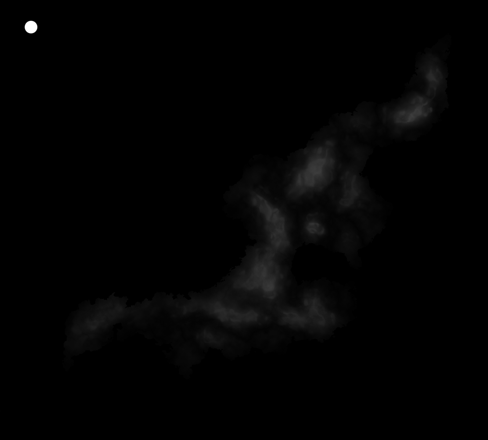 |
A greyscale PNG height field built using this tutorial,
showing the island of Torvan, southwest of the Great Caldera. |
A height field is a specialised map of an area, modelling altitude/elevations. They are also known as height maps, bump maps, or more formally
Digital Elevation Models (DEMs). Like regular image files, height fields are made up of point-based data, and in fact many height fields use the pixels of regular image formats such as PNG and TIFF to store and display their data, usually in
greyscale. Each pixel on the map represents the elevation at that point; as such, the resolution of the map directly determines the accuracy.
DEMs come in a variety of formats, but for our purposes the most useful are the most easily accessible and editable regular image formats. I use PNGs for all my height fields. (Note that Photoshop needs a third party plugin such as
SuperPNG for full compatibility with PNG files over 30,000 pixels square.)
White is high, black is low
 |
Do you see the black as the land? Don't
worry, you'll quickly get used to seeing
white as the high ground, although it
may well seem counterintuitive at first. |
In height fields, the highest points are represented in white, with darker and darker shades of grey standing for lower and lower elevations, until the lowest points are shown in black. For this reason, height fields often show white land on black sea. If the sea floor is not shown, pure black is sea level, and everything else is land. It's also possible to show both the sea floor and the land, in which case a certain level of darker grey will represent the point where the sea meets the land at sea level.
Advantages of Height Maps
But what exactly is a height map for? Why are they useful? What do they allow us to do?
Well, since they show elevation data, they can be displayed as 3D models. Because of this, they are often used for terrain in 3D computer games. In terms of fantasy mapping, height fields potentially allow us to walk around and fly over the worlds we create.
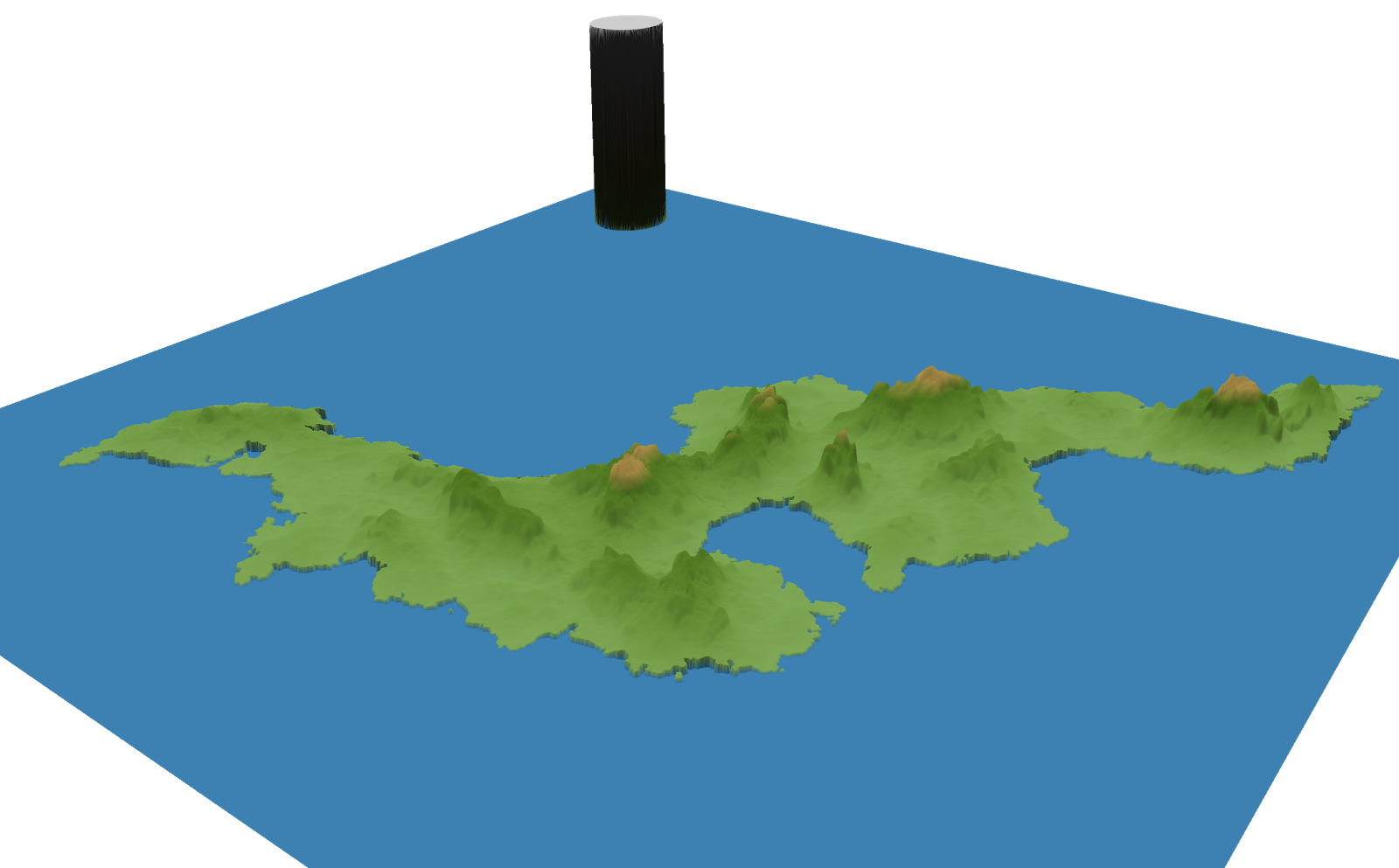 |
Wilbur's 3D preview of the height field above, using a custom shader.
The dark pillar is the height marker, showing the relative height of
Calidar's highest mountain, at 8,925 m. |
But there's an even greater function for cartographers: they facilitate the creation of shaded relief — topographic shading showing the shape and contours of the land. This can be done using various kinds of shaders in Wilbur, or by rendering the scene in a fully-fledged 3D rendering engine such as
Blender.
Finally, the elevation data can be cross-referenced with other data to produce other kinds of shading. The most accessible form of this is the climate shading of Fractal Terrains, which applies textures to the land based on altitude, temperature and precipitation.
All of these functions will be covered in future articles in this series. For now, let's get back to the topic of creating out height field form scratch.
Making a Base Height Field in Photoshop
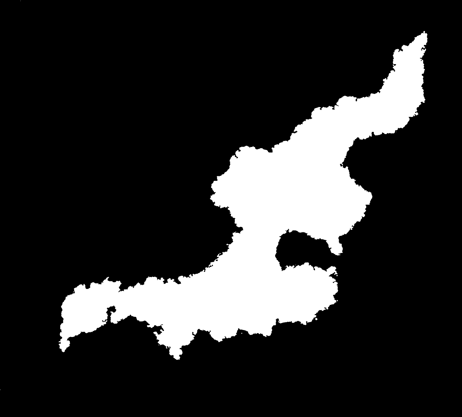
 |
| Feorad cropped from the Equirectangular Projection Calidar world map. You may want to consider reprojecting each continent or region and working on it separately. There is no one perfect projection, but conformal (shape-preserving) projections are desirable for working on height maps and erosion. At a bare minimum, the poles will need to be done separately from the rest of the world. |
Setting Up
Open your finished continental outlines file in Photoshop. If it needs cropping, reprojecting, or scaling, do that now. (See my previous articles on
Continental Outlines and Map Projections and
Scale for more on these topics.) If it's not already white land on black sea, you'll need to make that change now too. After changing the colours to black and white, run
Image / Adjustments / Threshold / 128 to make sure that the edges are sharp — anti-aliasing can cause problems during erosion, so it's best to work with sharp edges for now.
 |
| Feorad reprojected onto a conformal projection, Lambert Conformal Conic. The point at the top is the north pole. This is revision 4j. Early on I decided to use a number plus letter versioning notation for Calidar's maps, starting with 1a. Major changes incur a number increment, while minor changes advance the letter. The resulting version codes are easier to remember and therefore more meaningful. As of February 2014, Calidar's latest revision is 4j. Other worlds have their own codes, so Soltan is on version 2c, and Ghüle is on 2a. These codes allow me to see what maps and data are concurrent with each map. |
Since this is an image map, we don't need any colour:
Image / Mode / Greyscale. You can work in either 8 or 16-bit. These settings are also in the
Image / Mode menu. 8-bit provides 256 shades, while 16-bit ups that to 65,536 shades. If you're going to be doing erosion anyway, it's not actually all that important, because erosion will smooth over imperfections in the height map anyway. Using 16-bit files will also take more memory, and entails longer loading and saving times. Personally, I usually work with 16-bit PNG files despite these disadvantages.
Name the coastline layer with the world/region name and version, and set
Opacity: Multiply. This layer will be one of the top layers of your file. Multiply means that black will mask out everything below it, while white becomes completely transparent, allowing everything below it to show through. So you can think of this layer as a sea mask.
Let's create some layer folders to keep things organised. Do this now for the coastlines layer by selecting the layer and pressing
Control/Command G (or choosing
Layer / Group Layers in the menu). Rename the group to
Coastlines.
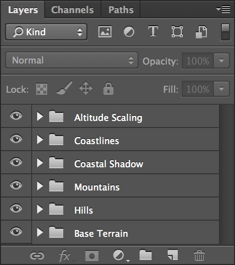
Groups may seem unnecessary now, but as you accumulate more adjustment layers they will be a big help. They also allow you to easily toggle the visibility of each group of layers.
Next we'll set up a shadow around the coast. These layers will make land fall away more gradually to the sea. Without them, your land masses will likely be surrounded by tall cliffs. Hit
W to select the Magic Wand Tool, set
Tolerance: 0,
Anti-alias off,
Contiguous off. Select the coastlines layer and click on the black sea area to select it. Press
Control/Command J to do a Layer Via Copy, then
Control/Command G to make a new group for it. Name it
Coastal Shadow, and move it out of the
Coastlines folder, to the bottom of the layers panel. Rename the layer itself
Coastal Shadow 1.
Right click on
Coastal Shadow 1 and choose
Blending Options, then
Stroke. Dial in the following settings:
Size: 50,
Position: Outside,
Blend Mode: Multiply,
Opacity: 100%,
Fill Type: Gradient,
Gradient: Black, White,
Reverse: Yes,
Style: Shape Burst.
Depending on your map, you may need to tweak this shadow. You can do this by adjusting the size, and if necessary the opacity. Come back and experiment with this later, when your height field is almost complete.
For now, click on the eye to
Hide the
Coastal Shadow folder. Processing this layer can be processor intensive, and you may find that the file is much more responsive with it off. Don't forget to turn it on again later, though.
Set up one more folder for future use: click on the folder icon at the bottom of the Layers panel to create a new group. Rename it
Altitude Scaling, and move it to the top, above
Coastlines. We'll come back to
Altitude Scaling later.
Terrain Layers
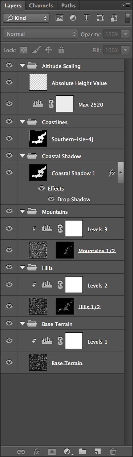
Now it's time to start on the terrain itself. Make three new layers at the bottom of the file, underneath
Altitude Scaling. Name them
Mountains,
Hills, and
Base Terrain, and place them in that order top to bottom. Create layer groups for each of these layers (
Control/Command G), and name them
Mountains,
Hills and
Base Terrain too.
Hit
D to reset palette colours to black and white, then
Filter / Render / Clouds in all three layers. For the mountains layer, optionally hold
Alt/Option while clicking in the menu to render clouds; this will give higher contrast clouds.
Optionally, you can render the clouds at half size and scale them up, or at double size and scale them down. Each white cloud will become a peak in your final map, so in this way you can control how big or small the mountains will be. Your choice will depend on the scale of your image. For Calidar, I rendered clouds in a separate file that was double the dimensions of the main map, then scaled them down and copy-pasted the layer in.
For all three layers,
Filter / Render / Difference Clouds, and repeat until you get a random texture to your liking. I'm partial to the valley-like channels you get with either one or three renders of difference clouds, so I tend to do just one step of difference clouds for hills and mountains, and either one or three for base terrain. Experiment and find something you like. Remember that at any stage you can also invert the clouds to get a different effect.
Add a levels adjustment layer (
Layer / New Adjustment Layer / Levels, or click the icon in the Adjustments panel) above each of the three terrain layers. Right click on each level layer and select
Create Clipping Mask (or
Alt/Option click the layer) so that the levels only affect the layer immediately below. Then dial in the following settings:
- Mountains: 0/1.40/188, Output Levels: 175/255
- Hills: 0/1.80/195, Output Levels: 87/191
- Base Terrain: 0/1.00/240, Output Levels: 1/104
Your file is now ready to go. Time to start shaping the terrain.
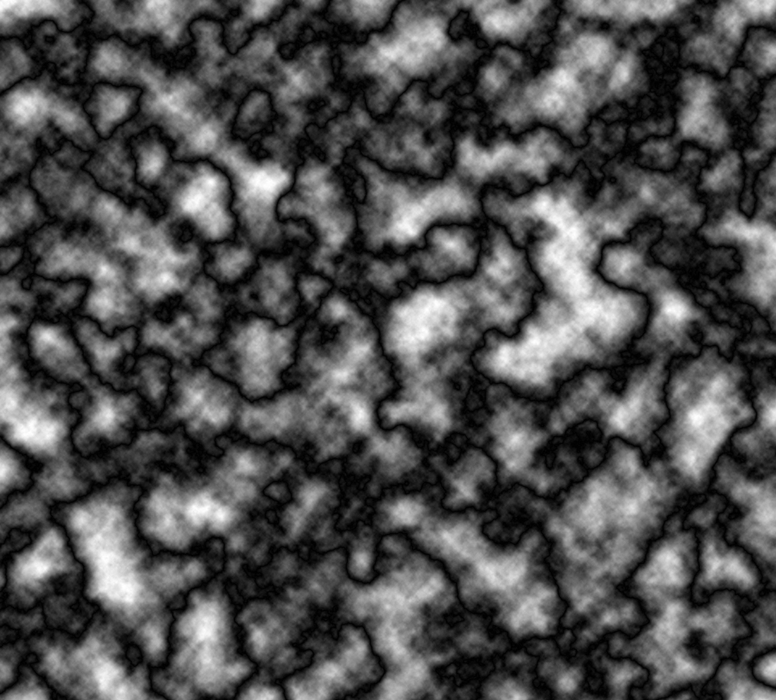 |
 |
 |
 |
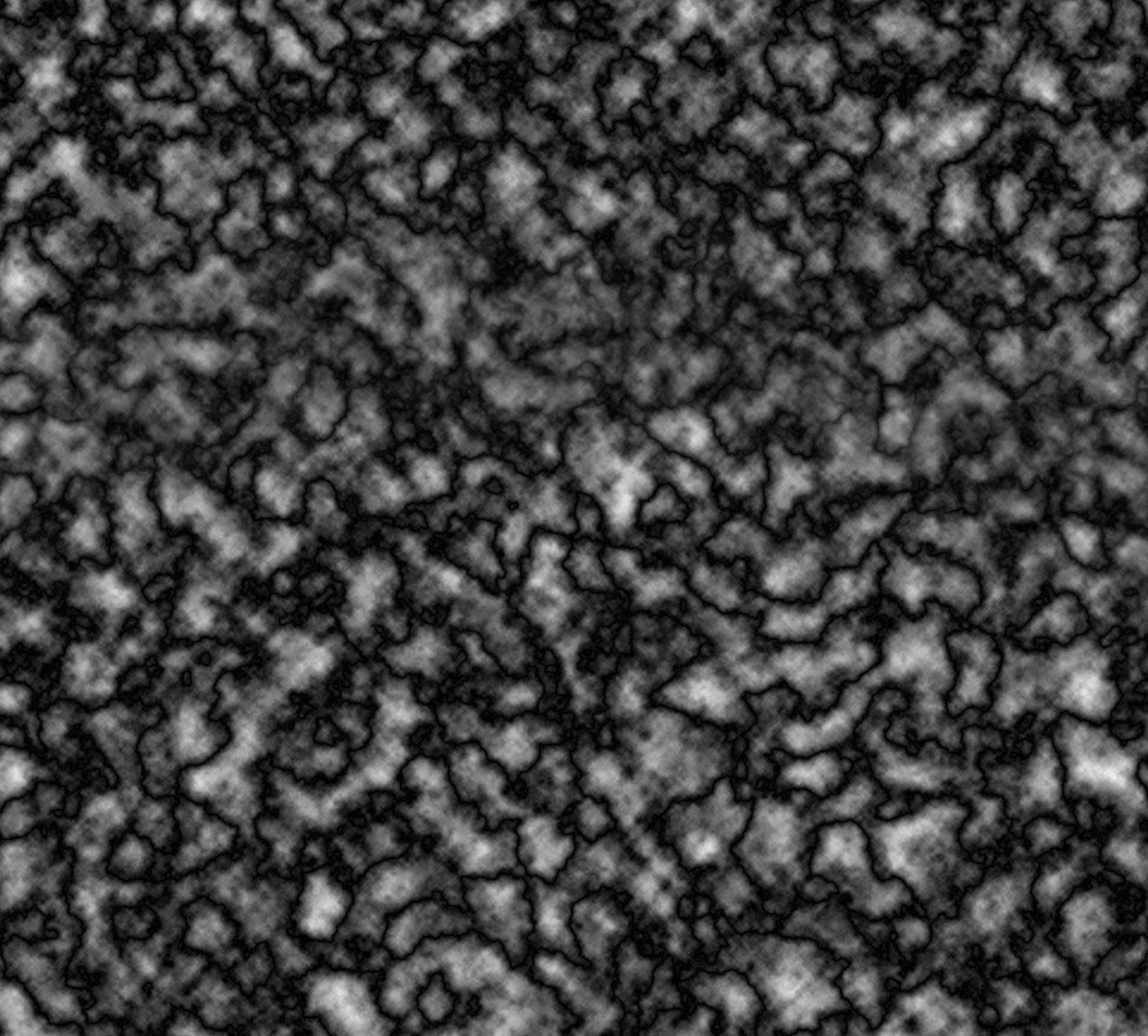
Difference clouds applied once
High contrast, full resolution
Mountain base layer |
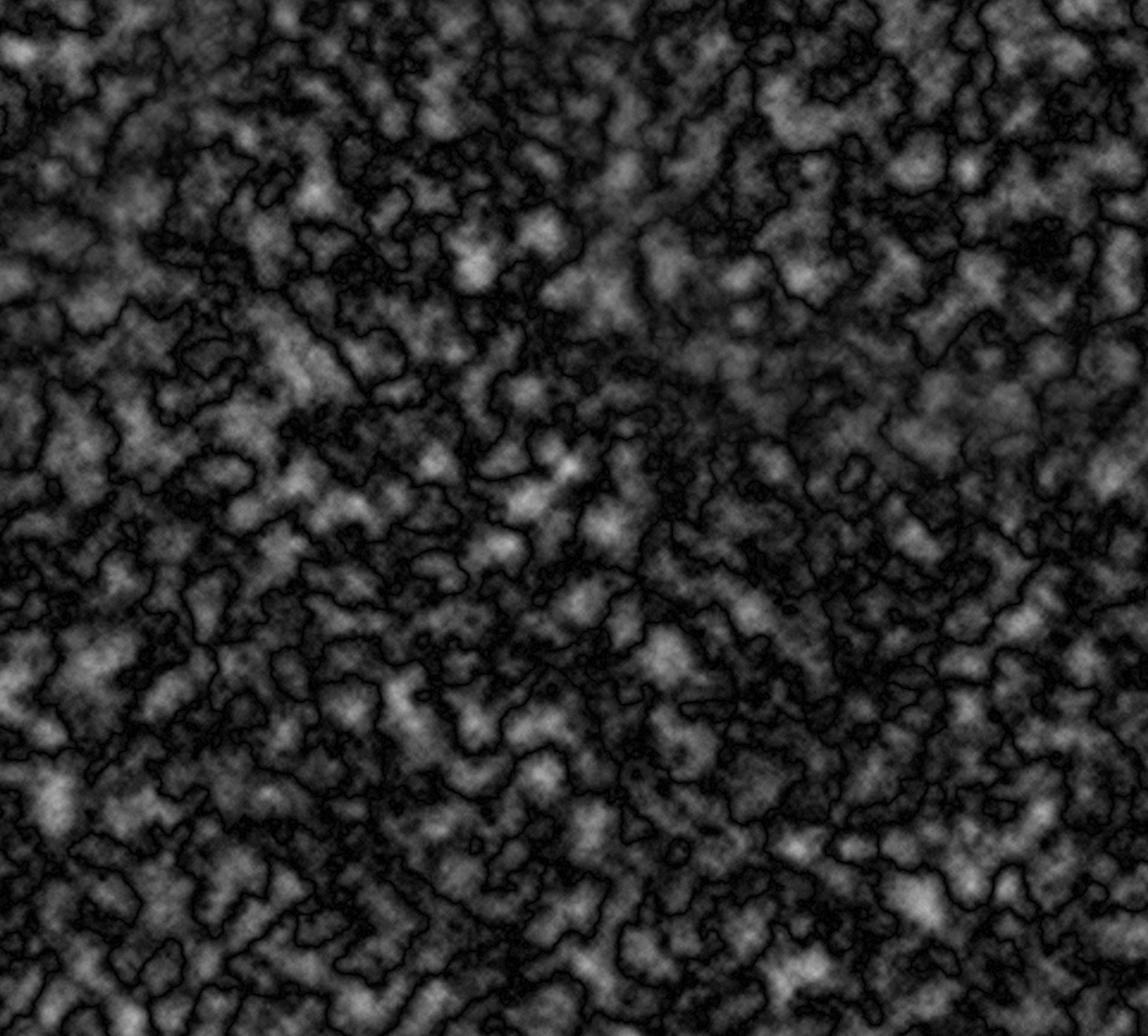
Difference clouds applied once
Normal contrast, full resolution
Hills/Base terrain base layer |
Difference clouds applied once
High contrast, double resolution
Mountain base layer |
Difference clouds applied once
Normal contrast, double resolution
Hills/Base terrain base layer |
Sculpting Hills and Mountains
Add layer masks to the
Hills and
Mountains terrain layers (click on the
Add Layer Mask button at the bottom of the Layers panel). Invert each mask by selecting it and pressing
Control/Command I. Your
Base Terrain layer will now be the only layer visible.
Next, draw in hills and mountains by painting white onto the layer masks of the
Hills and
Mountains layers. The layer mask determines where and how much of each layer shows through. There are a number of different ways to do this:
- Using a soft, large brush, draw the broad strokes of your mountain ranges and hills in the adjustment layers. Don't worry about making them random at this point — bold strokes with high opacity and large brushes are fine.
- Use hard brushes (or an to make more decisive strokes, then select them and use expand selection and feather selection, followed by fill white to soften them up. Again, don't worry too much about making them random.
- Use a tablet to sketch your mountain shapes. Set pressure-sensitivity to opacity, and it should be easy to create convincing ridges and chains.
- Click on the mask while holding Alt/Option to see the mask, and edit it directly. The main advantage of doing this is that you can paste directly into the mask, so it's possible to copy and paste other images to create your mask.
- Use filters to create or edit your shapes.
Regardless of how you create your mask, the last option is a good way of finishing it off. I use a jiggle filter to roughen and randomise my mountain and hill masks. Alien Skin's
Eye Candy 7 Photoshop plug-in has a "shower door" setting which can do the job, especially with extreme settings. Try experimenting with other filters to mess up your design.
 |
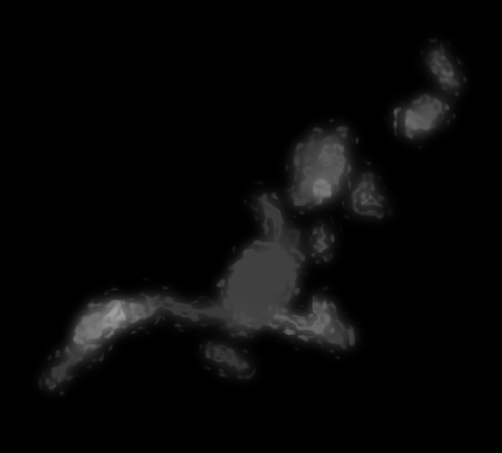 |
 |
 |
| Hills mask drawn with soft, low opacity white brush |
The same hills mask with "shower door" filter applied |
Mountain mask drawn with soft, low opacity white brush |
The same mountain mask with "shower door" filter applied |
Tweaking
When you are satisfied with your hills and mountains, zoom out and have a look around your map. Zoom in and look at the details. Tweak the layer masks here and there where necessary.
If you want to flatten out the base terrain in places, use the eyedropper to pick up a very dark grey (not black!), then paint on a new layer (call it
Adjustments) directly above the
Base Terrain layer using soft, low opacity brushes. The same technique can be used to make plateaus on the
Hills and
Mountains layers: create an
Adjustments layer, then pick up a median colour from the area and paint in your flat area, building it up slowly using soft, low opacity brushes.
Be aware that your base height map will more directly affect the final look of your map than any other factor. In particular, erosion will sculpt your mountains nicely, and it will smooth out minor artefacts and graphical glitches. But it won't solve major problems that were inherent in the height map to start with. It's worth taking the time to tweak things at this stage, at both micro and macro levels. The erosion process takes time, and such tweaks become much harder to do after erosion.
With that said, there have been many times that I didn't discover something was a problem until I finished the erosion process. As a result, most of Calidar's maps have actually gone through multiple passes of height field building and erosion, with each pass returning to the drawing board to fix various problems with the design before going through erosion once again.
Outputting your Height Map
Save your file, then
Layer / Flatten Image and save as a PNG. I have had problems using "save as copy" files in Wilbur, so although it's a more convenient option, it seems to be more reliable to flatten and then save as a PNG. Another option is copying merged: Select All with
Control/Command A, then
Shift Control/Command C to Copy Merged.
Control/Command N to create a new image just right for the clipboard data, and
Control/Command V to paste. Save that image as a PNG file.
Now it's off to Wilbur, for erosion!
Well, actually no — probably not yet. We will load up Wilbur, but before starting erosion, it's well worth going through one last round of tweaking.
Basin Tweaking
Load your PNG into Wilbur. Have a look around —
Zoom In with
Control +,
Zoom Out with
Control -. Seeing things shaded using Wilbur's shaders should give you a new perspective on your map.
Now let's see what happens when we use Wilbur's Fill Basins command. Filling basins is an important part of the erosion process, without which the incise flow command does not function. Any basins without drainage will be filled up to the level of the lowest drainage point in the surrounding rim. Unfortunately this means that it is not possible to include basins without drainage in your design. This includes lakes, which will need to be re-dug after erosion has been completed. If you want to include lakes or other such depressions completely surrounded by higher terrain, create a channel out of the area to lower terrain, and fill it in again much later after erosion processing.
Select / From Terrain / Height Range: 1 - 999,999 to select only the land.
Filter / Fill / Fill Basins or just hit
Control B. (Note that Wilbur's fill basins command is limited to images of 10,000 pixels square or less.) Then compare the results with your map in Photoshop. If it helps, save a copy out and import it in to your height map Photoshop file:
File / Save As / PNG Surface (the default — click yes for 16-bit). This will allow you to more easily see which areas need tweaking.
The areas filled in will be completely flat, which may be undesirable. Small areas can be ignored, as erosion will take care of them, but with larger areas it may well be worth tweaking the height map design to prevent them from being filled in. This is done by darkening the edge of the basin to create a channel to a lower area.
Wilbur has a number of different shaders to choose from, available in the
Texture menu.
Greyscale Bump Shader is the black and white raw data view which corresponds to the height map design in Photoshop. But this is not the most human-readable shader. I find that it's easier to understand what I'm looking at using the
Wilbur Shader, which is freely customisable. Although it's configurable to other settings, it's usually altitude-based. This kind of shading is known as
hypsometric tinting. It's easy to conflate climate information with this shading, which would be a mistake. It assigns colours based on altitude alone. For this reason, many cartographers avoid using a realistic-looking palette. As long as you bear in mind what the colours mean, there shouldn't be a problem – but bear this issue in mind especially when showing other people your map.
You can save any of Wilbur's shaders as PNG files — just choose PNG Texture in the Save As dialog window. Note that should you wish to import these into your Photoshop height map design file, you may need to first set your image to colour:
Image / Mode / RGB Colour. Otherwise the imported images will just show up as greyscale.
Altitude Scaling
There's one last thing to do before our height field is finished: scale the relative altitudes on the map. There are two reasons to do this:
- To keep all of your maps in scale with each other, and
- To add some variation to the height of mountain peaks across your map.
For Calidar, Bruce decided on the height of the highest point, and I added a white marker to all of the height fields showing that height. Altitudes across the map are then lowered using a levels adjustment layer. This is necessary because any height field loaded into Wilbur is automatically scaled across the maximum range of greyscale values.
The other issue is that my height map design can easily result in a map where the highest peaks are the same throughout a mountain range, or indeed throughout the map. This just looks wrong. The solution is in the same levels adjustment layer.
Here's how it works: make a new layer in the
Altitude Scaling folder, and name it
Absolute Height Value. Somewhere in the sea, draw a large white dot with a large, hard brush. This white dot represents the highest altitude on your world. Next, create a new levels adjustment layer below the
Absolute Height Value. Set the Output Levels at whatever level you want the average highest altitude to be.
You can calculate what number you need to enter by the following formulas:
Absolute Height Value / 255 = altitude per shade
Average Highest Altitude / altitude per shade = Output Level (highlight)
For example, on Calidar the absolute height is 8925 m. I would like to set the average highest altitude at around 2500 m.
8925 / 255 = 35
2500 / 35 = 71.4
The Output Level only accepts integers, so we have to round to 71 or 72, but regardless this will be about right.
Now comes the interesting bit: add a Layer Mask to the levels adjustment layer. Painting black with a soft, low opacity brush on this mask will gradually disable its effects. The affected areas will have their maximum possible altitude raised. This is a very powerful effect: you can use it to define the overall vertical shape of mountain ranges, and even to mark out certain peaks as being of certain heights.
Hypsometric Tints in Photoshop
Here's one last tip for working with height maps in Photoshop: you can use a Gradient Map to shade your terrain in exactly the same way as Wilbur's custom shader. This is invaluable, because it allows you to see a more human-readable version of your map as you edit it.
To set it up, all you have to do is place an
Image / Adjustments / Gradient Map beneath your coastlines file. Note that if you are working in greyscale you will need to change to RGB Colour mode in order to see things in colour. If this is unfeasible (for example if the image file is rather large, and in 16-bit greyscale), another option in Photoshop CC is to make a new file with the gradient map and use
File / Place Linked to insert a linked copy of your height map below it. The disadvantage is that you won't be able to see corrections as you make them.
You can customise your gradient map however you like; for Calidar I have recreated my custom Wilbur shader in Photoshop, so that I can use the same colours in both programs.
Gradient maps in Photoshop will be covered much more thoroughly in a later article, so I'll leave it at that for now.
Erosion
Once you've finished all this tweaking and are satisfied with your design, save your file one last time, then follow the instructions above under
Outputting your Height Map to save your finished height field as a PNG for use in Wilbur.
That's all for this tutorial. Erosion will appear soon in its own article.


